top of page
.png)
My Role?
Product Designer (Jan 23 - Present)
Jr. Product Designer (Oct 21 - Jan 23)
Team?
Design team
(3-6 members)
Other stakeholders
(tech + sales + product, etc.)
Project Type?
Full time
Tools?
Figma
Zeplin
Microsoft Clarity
Google Analytics
Google docs + sheet
Timeline?
around 2 years
(Oct 2021 - Present)
Company?
GrayQuest
Mumbai, India.
Introduction:
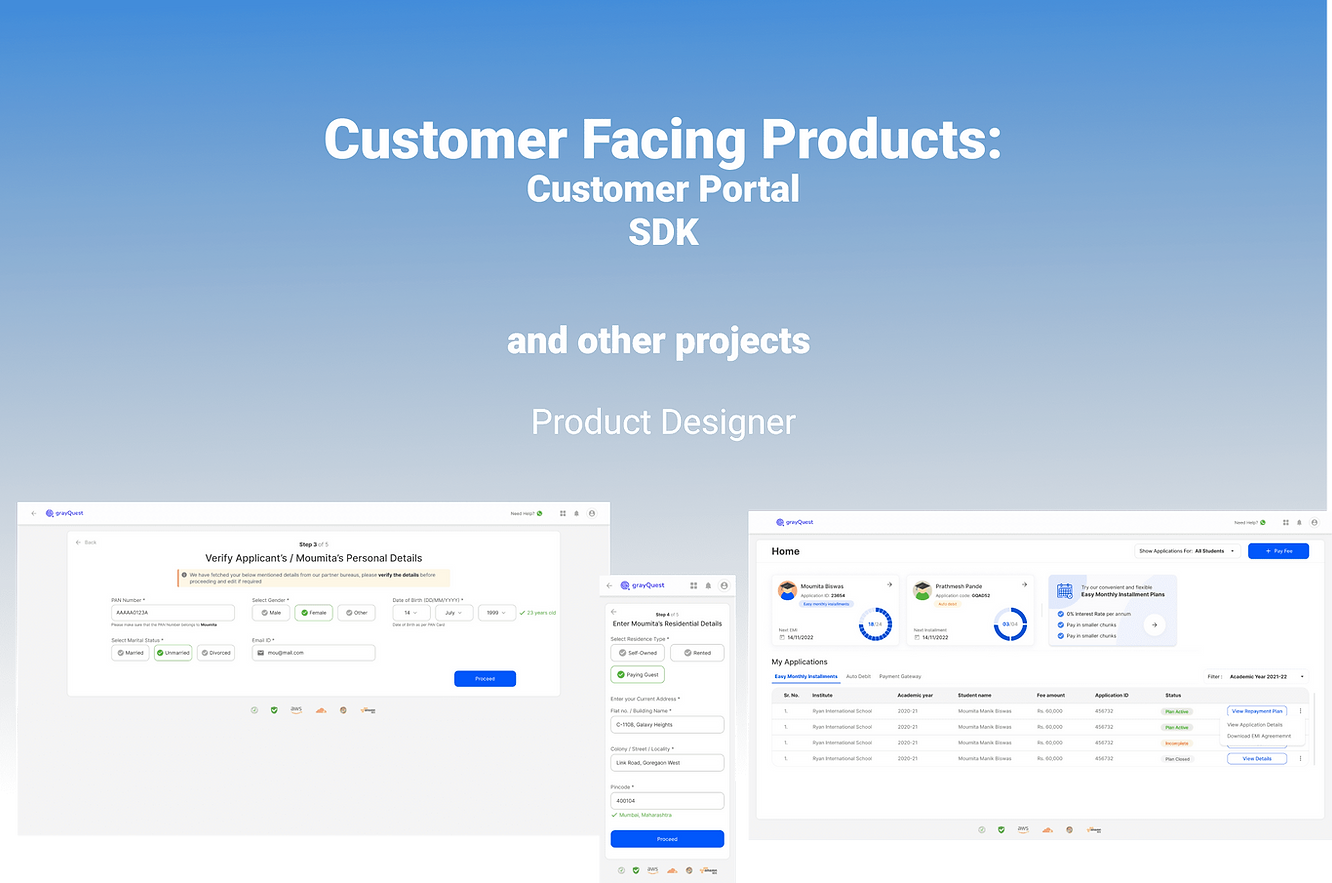
Hello readers! In this span of almost 2 years at GrayQuest I have worked on customer facing product mainly customer portal and SDK and then other ad-hoc work like on app, sales requirements and fms.
Being the 3rd designer in the team when I joined and now when the product design team has 5 designers, I looked after entire customer portal and then SDK.
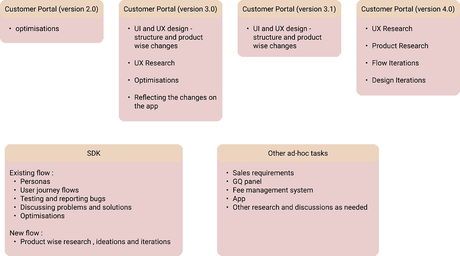
My projects here are mainly:
%20(1).png)

Let's get started with my GrayQuest dairy! :)
1.
Customer Portal 2.0
Needs repair!
Customer Portal 2.0
DISCLAIMER: This project contains the sharable work related part of the conversations only.
It does not contain any business related or other confidential message by any means.
HOW DID IT ALL STARTED?
When I joined GrayQuest, the portal where customers take our EMI (easy monthly installments) service was:
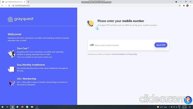
Customer Portal version 2.0 (video part 1)
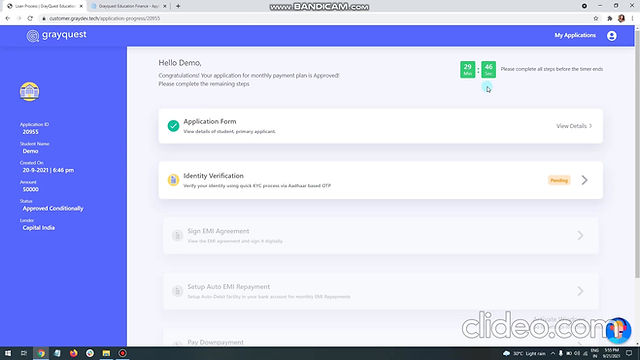
Customer Portal version 2.0
(video part 2)
They needed me to optimise the Customer Portal version 2.0 first and then revamp the entire Customer Portal UI and UX wise, while the product team was seeing for the flow changes.
OPTIMISATION -
WHAT AND HOW DID I DO?
#1 Understood and explored the current flow myself :
1. I had received the customer portal version 2.0 explanatory recording - saw and understood the flow from there
2. Then I went through the entire portal (all different paths and subparts in the flow) by myself, to understand and get the experience of the entire flow myself.
3. Noted down the flow and points I felt problematic - for my understanding and ideations later.
.png)
#2 Eye tracking :
1. I had noted by my experience, pain points and ideations
2. Now I wanted to see what real user's experience was like.
So I asked for the eye tracking tool our company uses (Microsoft Clarity)
3. Noted down the insights I got properly.
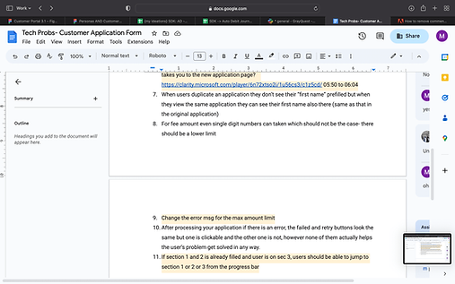
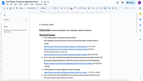
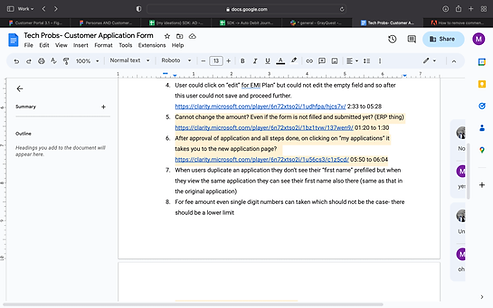
- noted and reported the bugs or the technical problems to the team team in the presentation meeting quickly
- noted the user experience insights for my optimisations.
.png)
.png)
.png)
Some examples:
Some technical problems found.
.png)
BTW, this is my one of the favourite ux research method! eyetracking
I always enjoy spying and analysing problems to ideate o solutions :)
#3 Ideate :
1. I now have the problems, I started ideated on each problem.
2. For the once I don't have solutions, I did a little
- competitor's analysis and
- secondary research in the starting,
to have better solutions and know the practices in the field - specific to the problem now.
#4 Optimise! :
1. Noted down my optimisations with reasons properly
2. Presented it to the tech team - vice president, front end developers, back end developers, product managers and my design manager
Discussed on the solution ideas and feasibility of the ideas and things thta can be developed right now vs. in the next version.
OUTCOME:
-Ideas went for development:
All solutions feasible, after discussion was taken to be implemented.
Solutions that can be done, not now but later were also taken for upcoming versions.
- Team liked my work:
As my manager had informed me that the VP of engineering has mentioned that he and the team liked my work.
Yayy, so happy :)
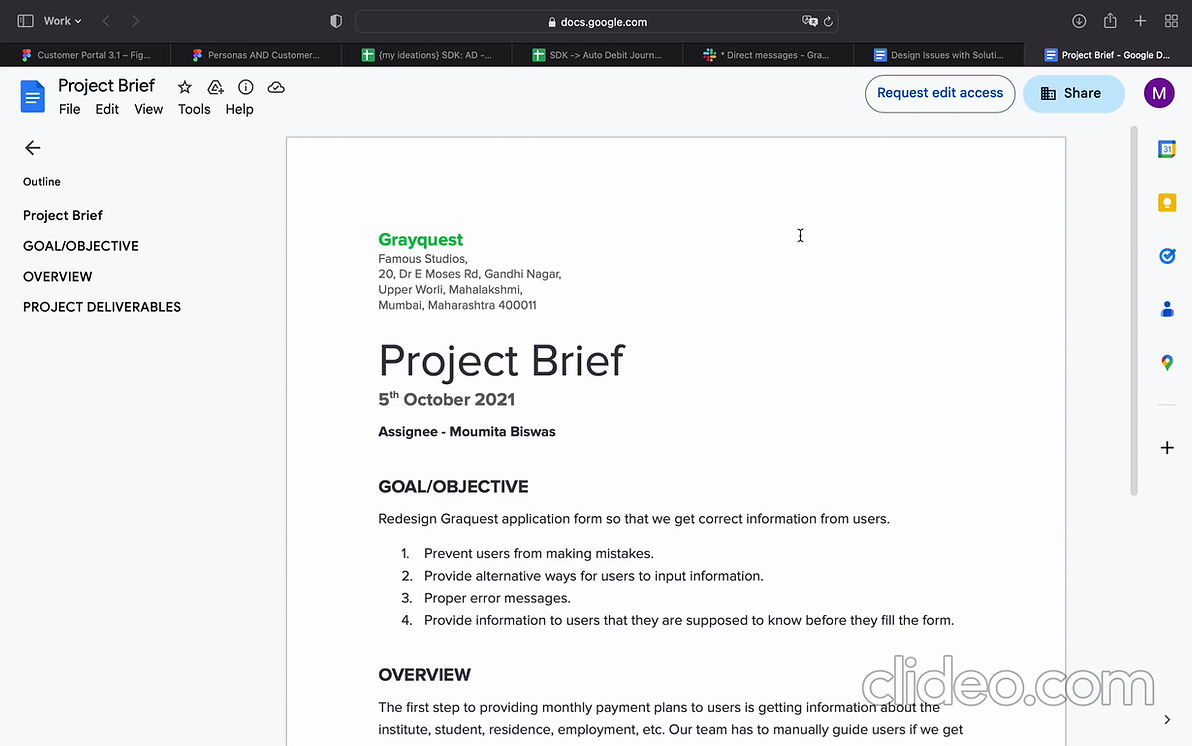
Optimisations!
WHAT'S NEXT? :
Customer portal 3.0!
A complete UI and UX revamp with Product flow changes.
2.
Customer Portal 3.0
Let's revamp!
Customer Portal 3.0
REQUIREMENTS?
After the 1 week optimisations, the team had the revamp of the entire Customer Portal 3.0 in their planning.
So they assigned me the entire Customer Portal revamp (from version 2.0 to 3.0 :) )
UI and UX wise.
This time I was explained the changes and the new flow.
What's new expected?:
- "Smart match" feature to get and prefill applicant's data - to reduce fields to be filled in the long form.
- Introduction of taking applicant's selfie for identity verification
- Application form's fields changes, took mandate creation after downpayment (business call), etc.
- Complete UI revamp
- Complete UX revamp
- Content revamp where needed.
WHAT DID I DO?
So since I need to revamp the entire portal, I need to do some initial mind planning to get started and then work as things goes ahead, as per the requirements.
It was a long process, let's deep dive into the ocean :
#1 Understanding, thinking and planning :
Discussed the requirements exactly with my manager, made a starting point plan and discussed it with her to be sure of the expectations.
Me being new to the fintech world, had to first understand the environment from scratch. I explored, discussed, understood and then ideated and worked on the solutions from all aspects.

Some discussions.
#2 Did competitor's analysis :
I did competitor's analysis to understand the
- product flow
- user experience
- ui inspirations
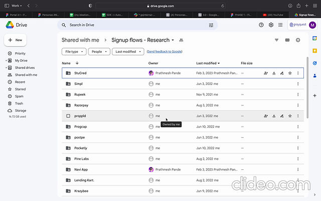
Some competitors
<will show the competitor's analysis in a little more detail in the further research sections below>
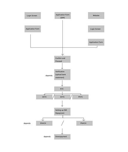
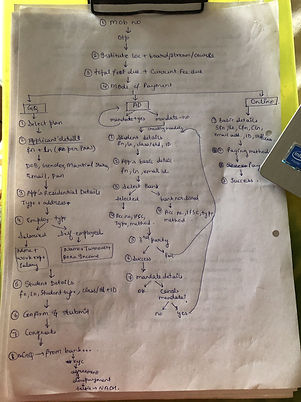
#3 Made the user journey flow :
To understand the flow transition from version 2.0 to 3.0 , I talked to the stakeholders and made the entire user journey flow.
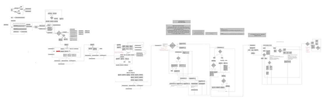.png)
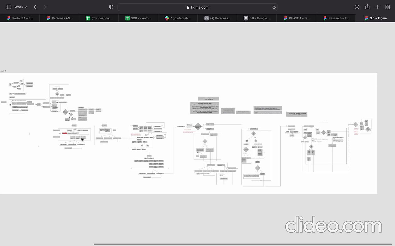
Understanding entire flow
(I discussed with the stakeholders and I then made the flows)
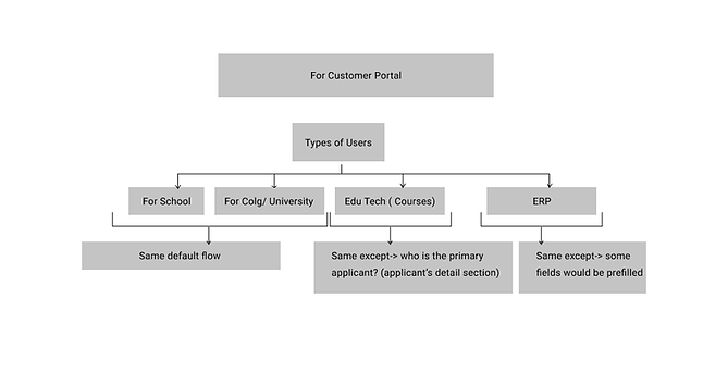.png)
.png)
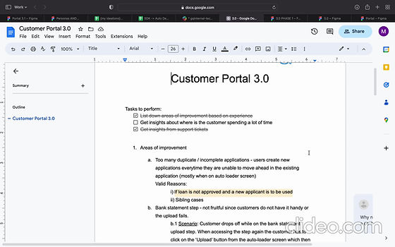

These kind of discussions with the product
(This document is not mine)
#4 UI :
- Made moodboard of inspirations
- Started iterating screens based on the good practices I understood so far.
- Made design system
#5 Discussions, meetings and presentations :
Discussions were mainly :
- Discussions with the product team about the flow
- Discussions with my design manager and a fellow designer about the design decisions and feedbacks.
- After many iterations - presenting and discussing with the entire tech and product team including the VP, COO and the founder.
(learnings:
- it took a while to understand what kind of ui they prefer and why
- confidently presenting my ideas)
#6 Implementing changes :
As we discussed the designs and the flow with the founder, often there were design and flow changes - which we implemented.
#7 Design handoffs :
Once the designs were approved finally by the entire team, I pushed the design system and the designs on Zeplin as:
- making every image needed exportable
- adding notes of changes in the versions
And documented :
- error cases and error messages per screen
- product specifications - interactions per screen.
for development and shared with the team.
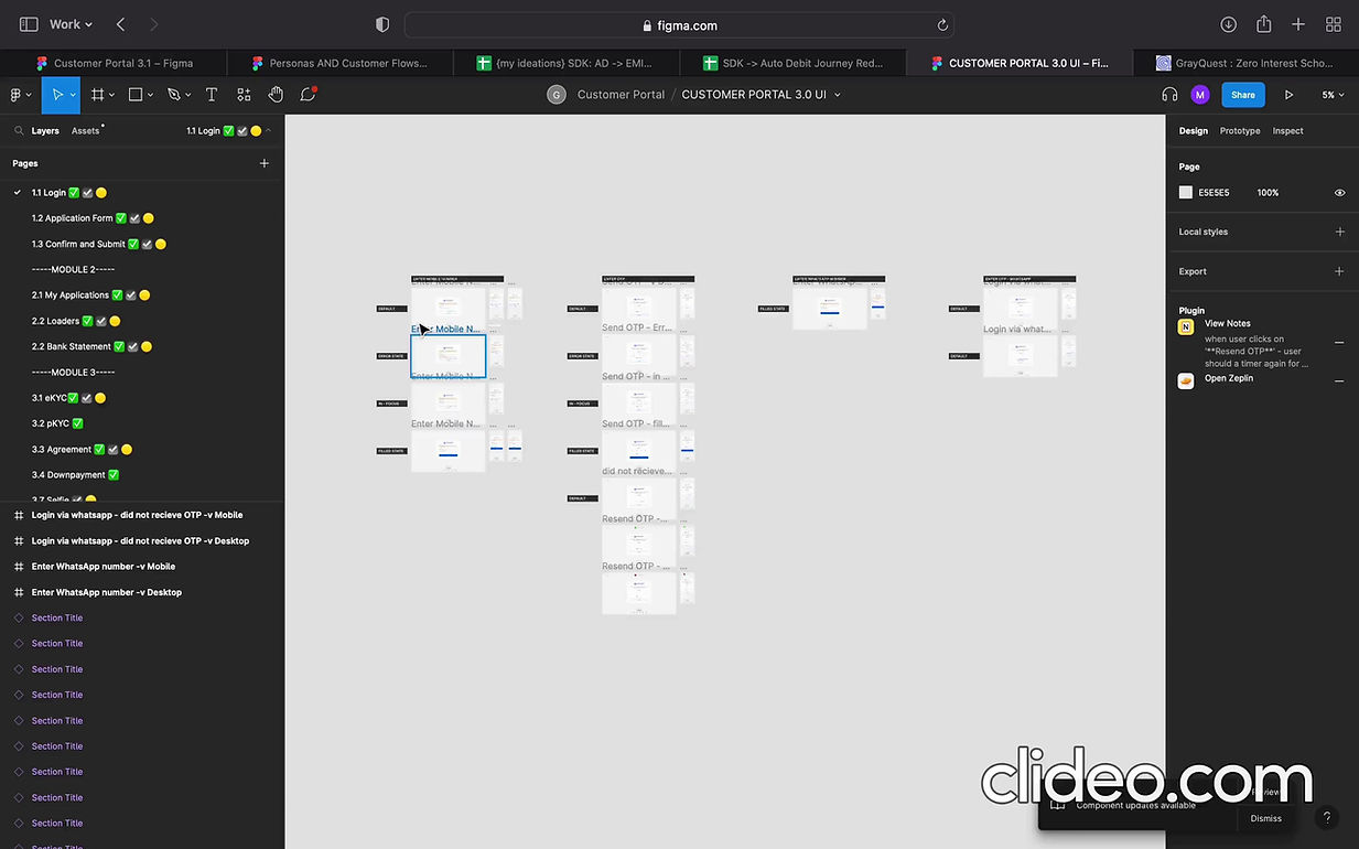
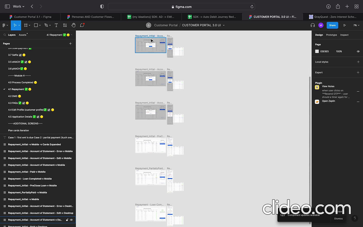
Customer Portal 3.0 UI
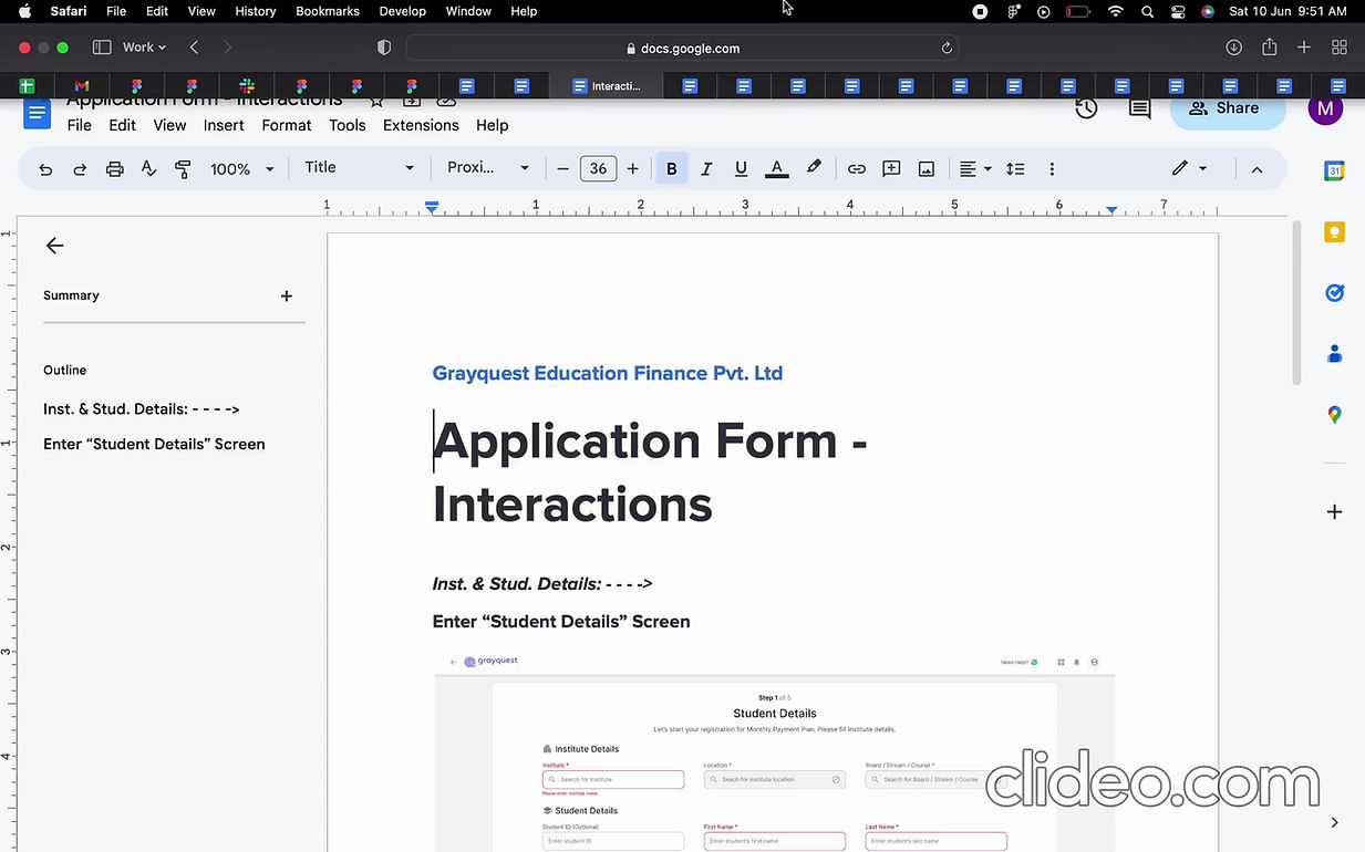
Interactions AND error messages documents screenwise
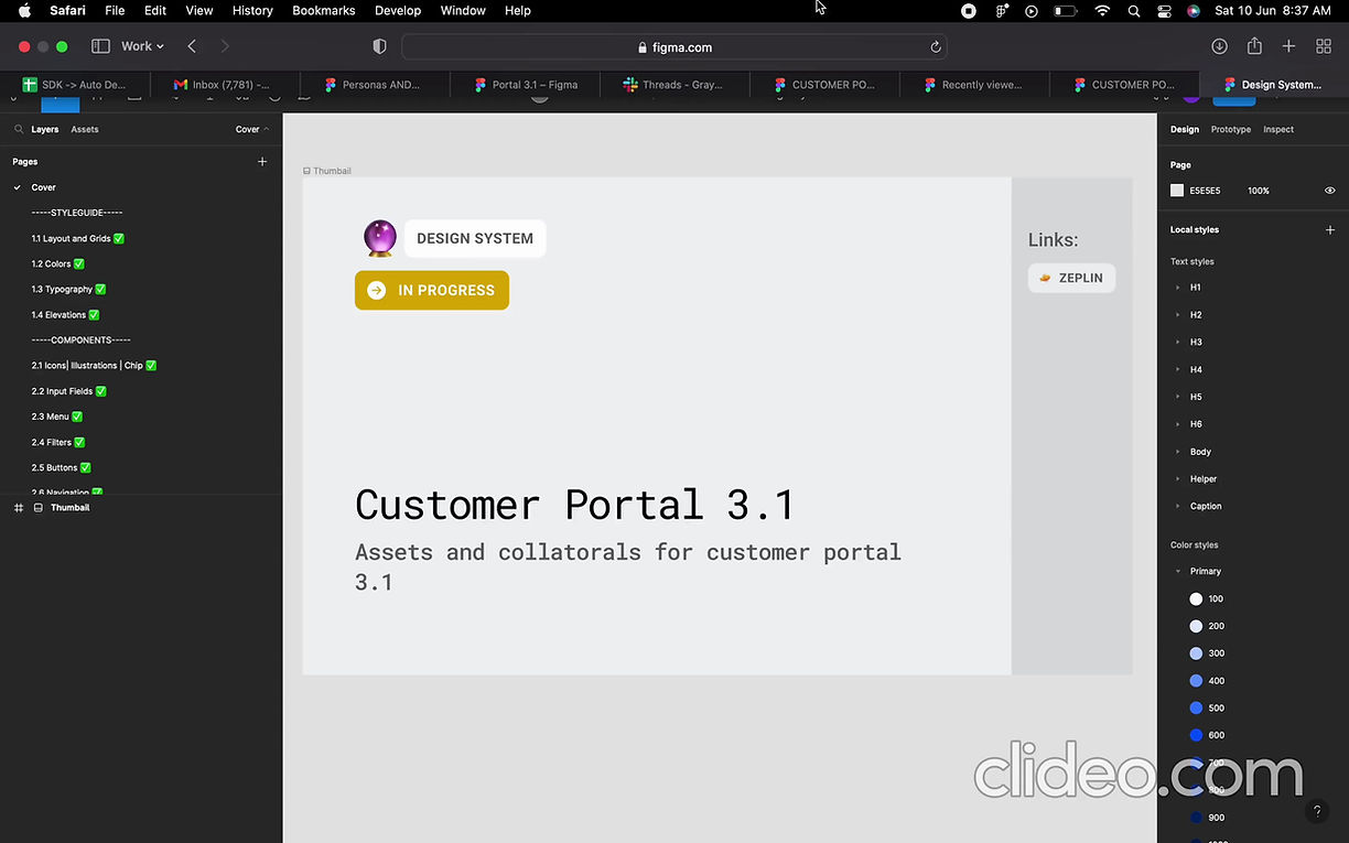
Customer Portal 3.0 Design System
(used the same for 3.1 later)
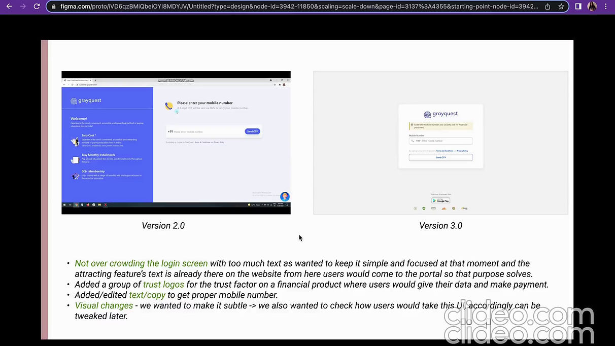
Major UI changes in version 3.0 from version 2.0
#7 Testing :
Did UI testing of the entire system on live and sat with the developers to convey te problematic points and discussed any additional solutions if needed.
Then as per the needs and requirements and the bandwidth of the team, discussed the priority of the changes - some got implemented and some got noted for later implementations.
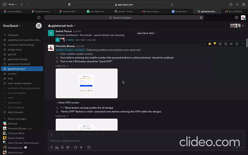
Problems in the 3.0 post development.
3.
Customer Portal 3.0 - Research & Optimisations
Due to the timeline, there were quite a lot of spaces where I knew that research and improvements might be needed.
Also we did research post version 3.0 went live - worked on solutions then!
Customer Portl 3.0 Optimisations
WHY?
After version 3.0 went live, we wanted to check and research on the following :
- Problems solved in respect to the version 2.0
- User experience in the new version 3.0
- User expectations and pain points from the services we provide in general (because we did not get the timeline for research before)
finding out problems so that we can take those points and work on the solutions.
WHAT DID WE DO?
- Analysing the emails users send asking for help! - hello mails
- Eye tracking and analytics
- Interviews
- Field research
- Ideations and optimisations
Let's see each section and how did it help!
#1 Hello mails! :
Our users send their problems via email
I started understanding, noting and analysing them:
- which section has how many problems,
- what are the problems exactly
Then communicated with the team, made design optimisations (under optimisations section), took feedbacks and after approval shared it further to the developers.
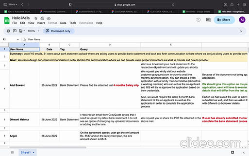
example: 2 hello mails sheet.
Outcomes:
The problems were of the type:
- technical bugs - reported to the team on spot
- user experience problems
Major problems found in the user queries email were - experience wise :
1. Majority of the problems (80%) was with the bank statement screen :
Users submit the wrong kind of bank statement and then our team has to reach out to them and ask for the correct kind of bank statement again
This impacted both the user experience and the team efforts taking their bandwidth.
2. KYC service had problem - otp wasn't going to the number.
3. Downpayment with credit card wasn't getting accepted - users were unaware of it.
2. Users did not know that they can view their repayment schedules from the portal, they asked it separately via email.
3. Users did not know what needs to be done after the final success screen.
4. On a process taking time, users had no clue what needs to be done.
#2 Eye tracking! :
My favourite part is back!
I checked and noted down the problems I saw on Microsoft clarity -
Problems were of the kind :
Noted and send some on the document via email and some reported / worked on directly.
.png)
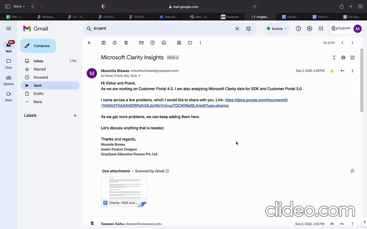
Microsoft clarity analysis
Outcomes:
- UI alignment problems on different browsers (Development problem)
- CTAs not working
For example: "create new application","verify" button not working, etc. (Development problem)
- Different services (ours and 3rd party's) not working from time to time.
For example: agreement template not generating, ekyc not receiving otp, etc. (Product problem)
- User getting confused on where to click - clicking on non clickable area.
For example: clicking tags on the application cards (Design problem)
- Longer completion/ filling time due to long form, not so common details like submitting statements, documents, etc. (Product + Design problem)
- Service working problem.
For example : first name and last name fetched and filled on first name field , selecting address from the list - it does not get pre-filled in the fields , message for one screen continued on the next screen too with is not relevant, mismatch of cta's and actions as "my applications" cta takes was taking to a new form for a few cases, can not change plan in a few cases, etc. (Development problem)
- Experience problem.
For example: screen does not scroll to the error field and when users are at the button, clicks on proceed and can not see the error in the screen - he/she has no idea why the proceed button is not working, error message should stay longer, description should not be empty. (Development problem)
- Confusing CTAs and UIs.
For example: maybe Edit application and view application i.e. “application details” is confusing., “Application details” part do not look like an overview mostly, some users don't seem to understand the mandatory and optional fields specially on mobile, etc. (Product + Design problem)
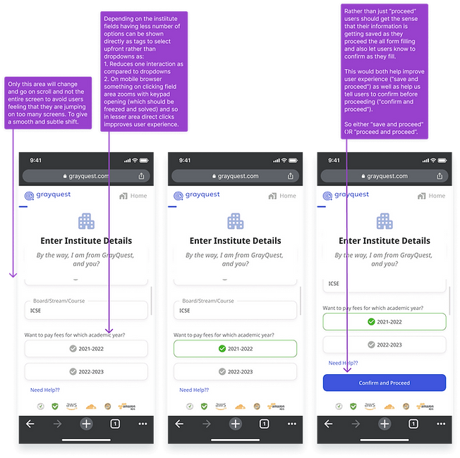
- Clicking on the dropdown and selecting takes time and not a good experience on mobile browser - rather for questions having lesser number of options we can directly show the tags to select upfront - one less interaction and easy to select. (UX design observation)
#3 Interviews :
Taken interviews of over 20 customer facing stakeholders to know the details user problems and kept taking to users for later after knowing problems from the stakeholders - to get an idea of the real situation first.
Interviews were taken on:
%20(1).png)
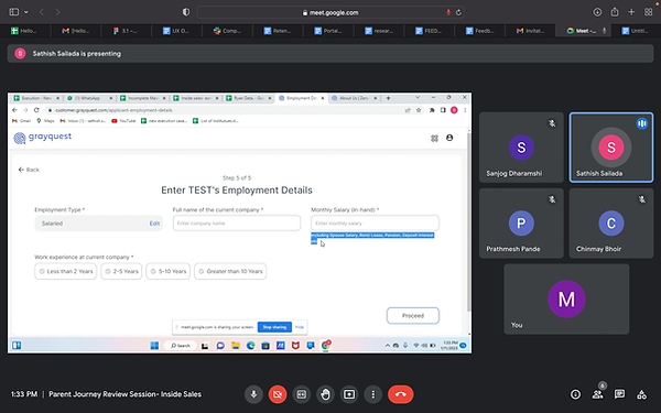
Outcome:
Got deeper insights on the user behaviour, pain points, expectations, product and development issues.
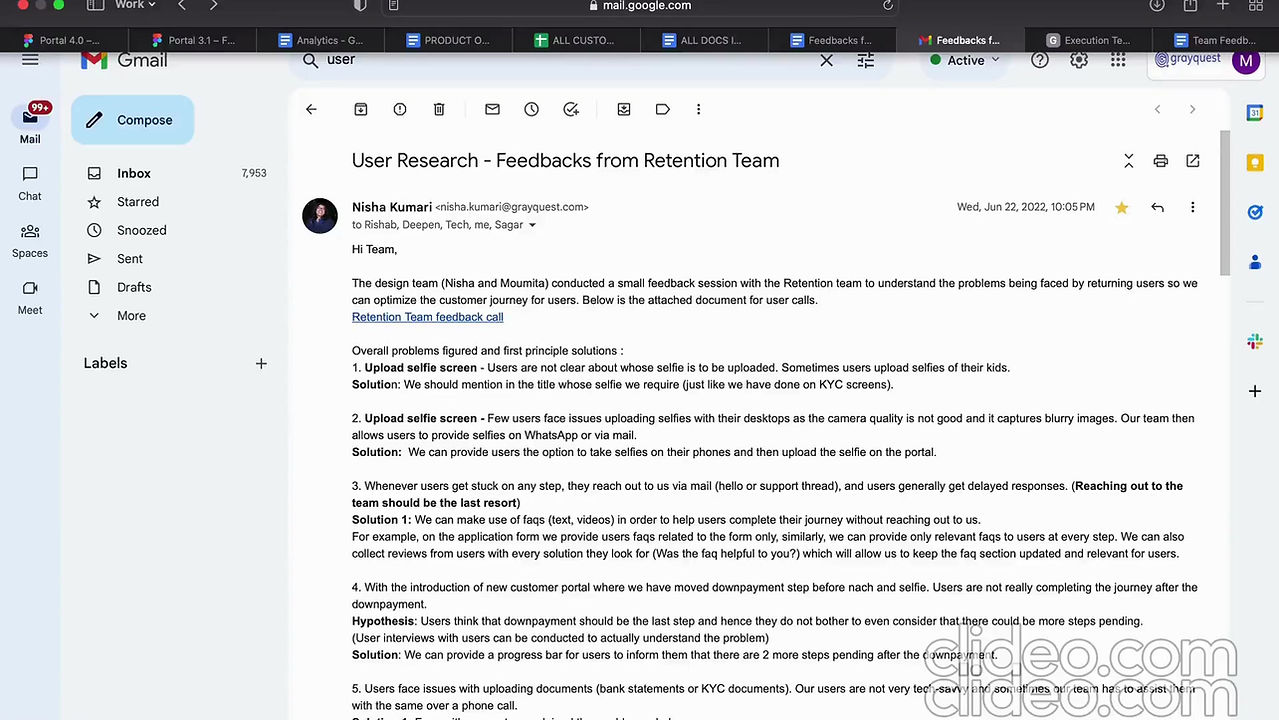
Insights from the interviews
#4 Field research :
We planed 1 field research to go to the spot, observe and understand the user problems and emotions. How our team handles and guides users there.
We planned and executed the 1st field research at GrayQuest.
Outcome :
We observed and understood 2 sides of problems, expectations and emotions :
1. User / Customer side
2. Our on field sales team's side -
how they handle and guide our users, what they have observed over the time, their pain points and expectations while working.
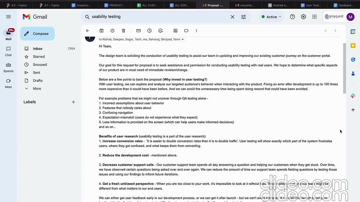
1st usability testing attempt here - plannings and the outcome.
#5 Ideations and optimisations :
Post handing off the version 3.0 designs to the team of developers and testers and researching + testing the customer portal,
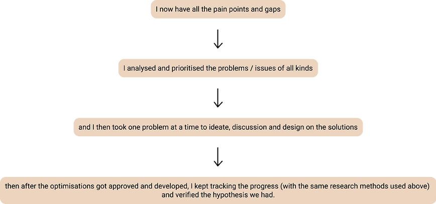
What did we do?:
.png)
.png)
.png)
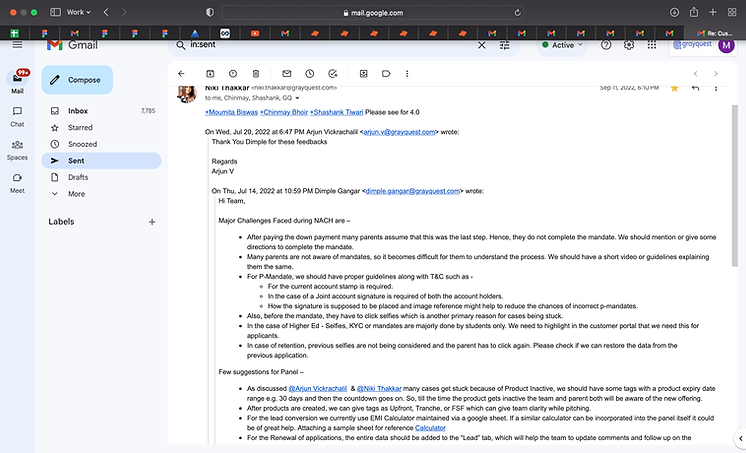
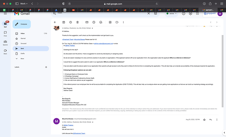
Some examples of the problems in the customer portal I am tagged in by the product.
I analysed, understood, ideated and then optimised.
some of the optimisations I did are:
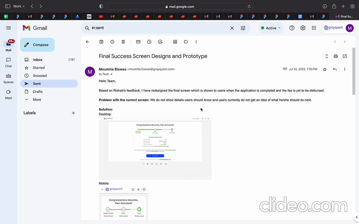
Post EMI activated - success screen.
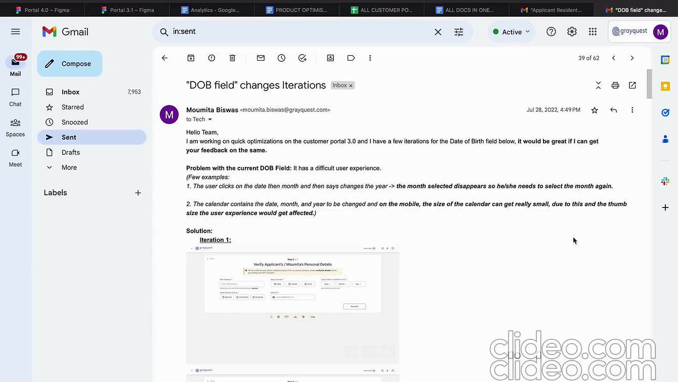
Fields optimisation - DOB.

Residential address optimisation - edit on the same screen.
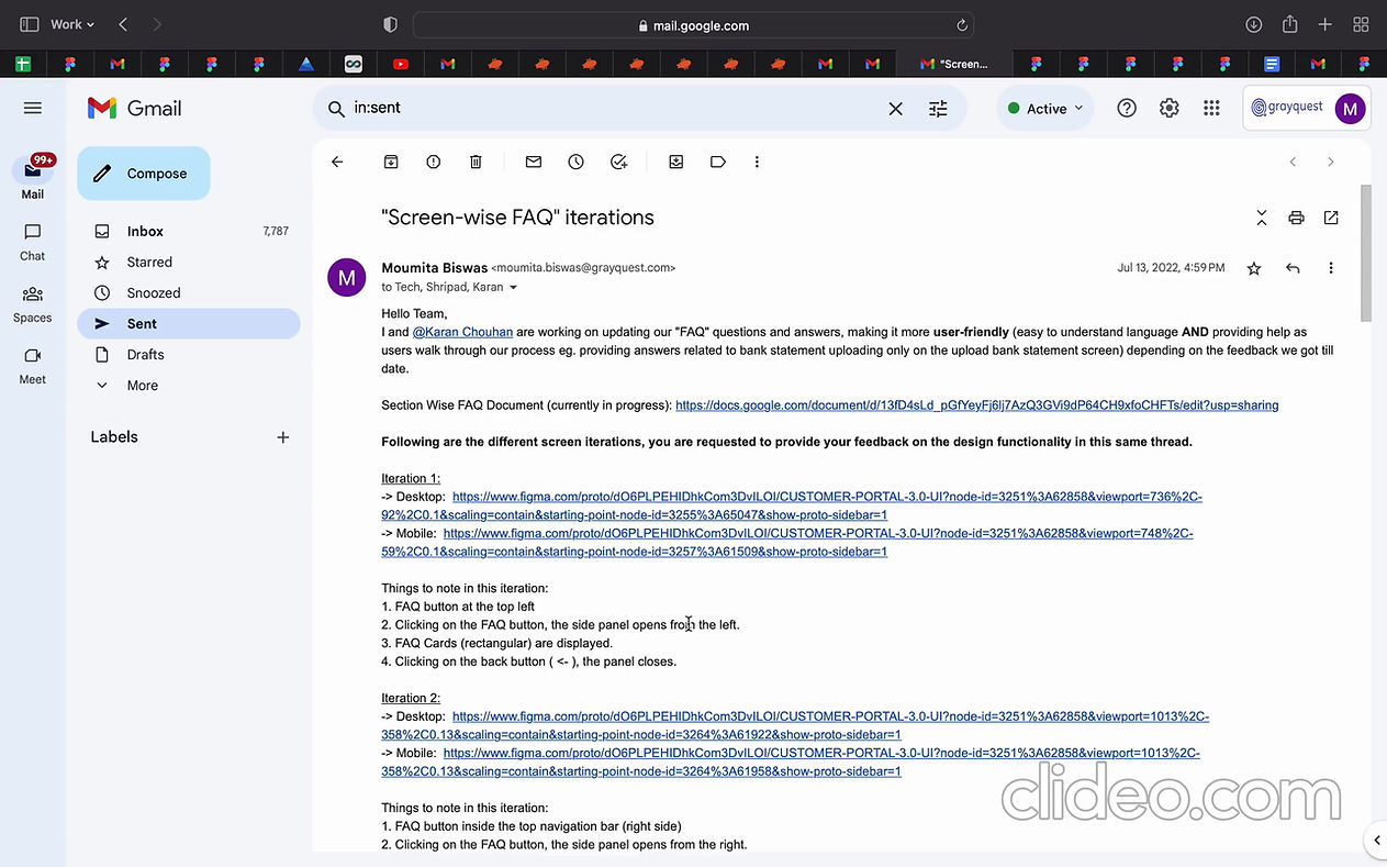
FAQ screens iterations & working on FAQ drafting.
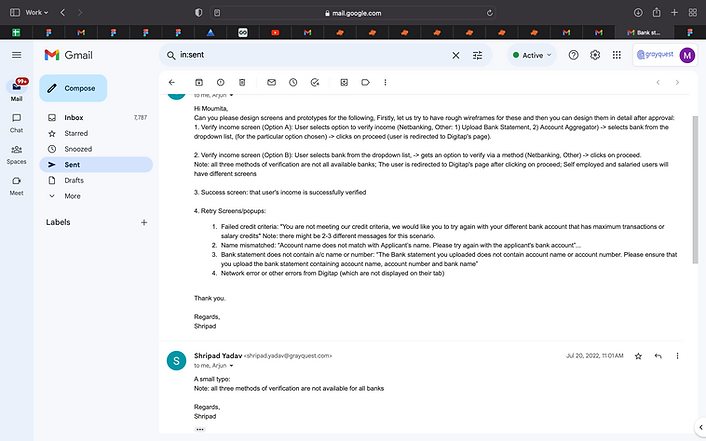
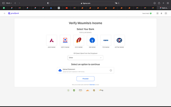
Bank statement - Introduction of Digitap
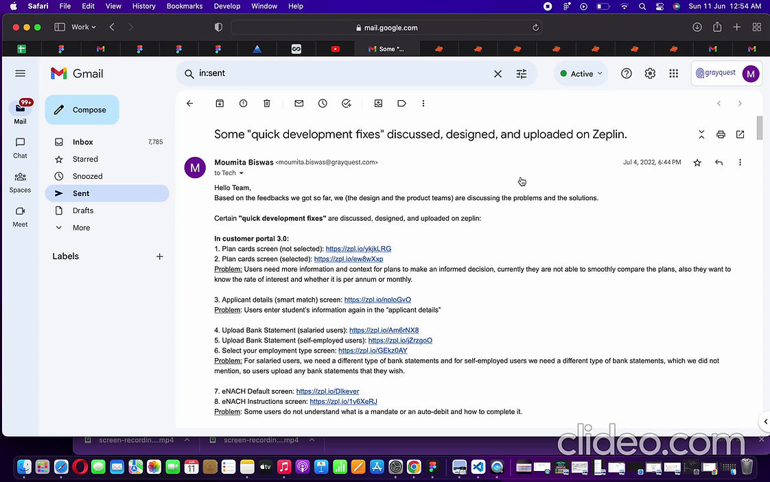
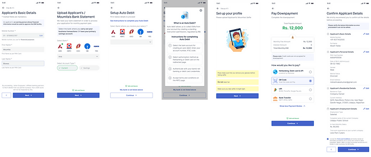
quick development fixes
UI/UX fixes that are quick to be developed.
Implemented these changes on the app too.
Outcome :
Optimised some of the problematic areas which improved the user experience.
After these changes got developed and went live - I checked the eye tracking tool (Microsoft Clarity), checked the hello mails and took feedbacks from the user facing stakeholders and found either a decrease or an elimination of these problems.
#5 Working on product service changes post version 3.0 went live:
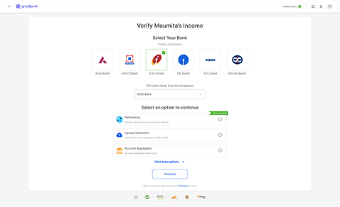
For example design the screens for the verification via bank statement screens when we now shifted to Digitap for this.
.png)
Version 1 of Digitap (entire new flow) was designed by me
and version 2 later (with some changes) was designed by one of my teammates.
Different banks had one or more of the "Select an option to continue" options.
4.
Customer Portal 3.1
The team had new product flows in hand, new services plannings and so they needed version 3.1 for it.
This version has flow changes and new UI for new screens with the same 3.0 design system due to time contraints.
Customer Portal 3.1
WHY?
The team had new product flows in hand, new services plannings and so they needed version 3.1 for it.
This version has flow changes and new UI for new screens with the same 3.0 design system due to time constraints.
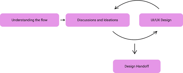
WHAT DID WE DO?
- Understanding flow
- Discussions and ideations
- UI and UX design
- More discussions
- Design handoffs
%20(1).png)
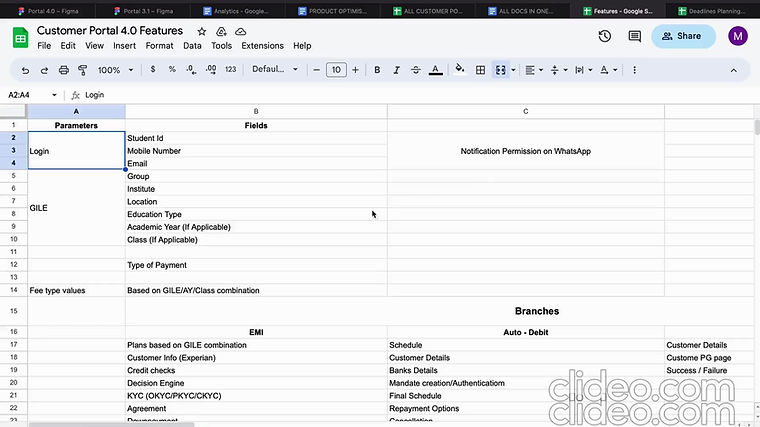
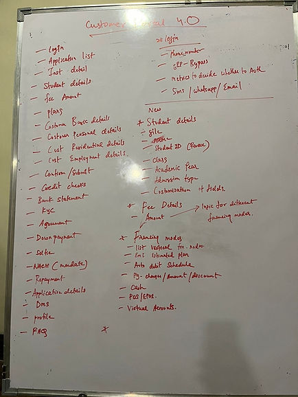
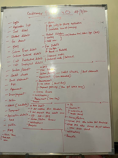
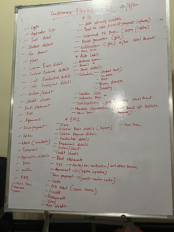
#1 Understanding, Ideating and Discussing the new flow :
Continuous discussions and ideations with the entire tech and product team on the new flow and design expectations.
Understood the flow, then designed and discussed with different stakeholders.
Had multiple levels of discussions and iterations on different modules and different aspects of discussions like product and design decisions
.jpg)
.jpg)
.jpg)
.jpg)
.jpg)
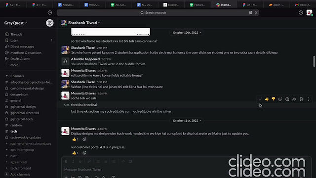
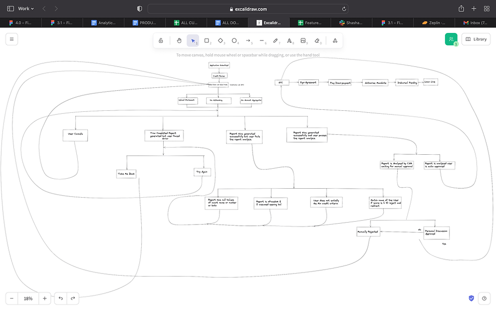
Some "Understanding and Ideating on the new flow" discussions.!
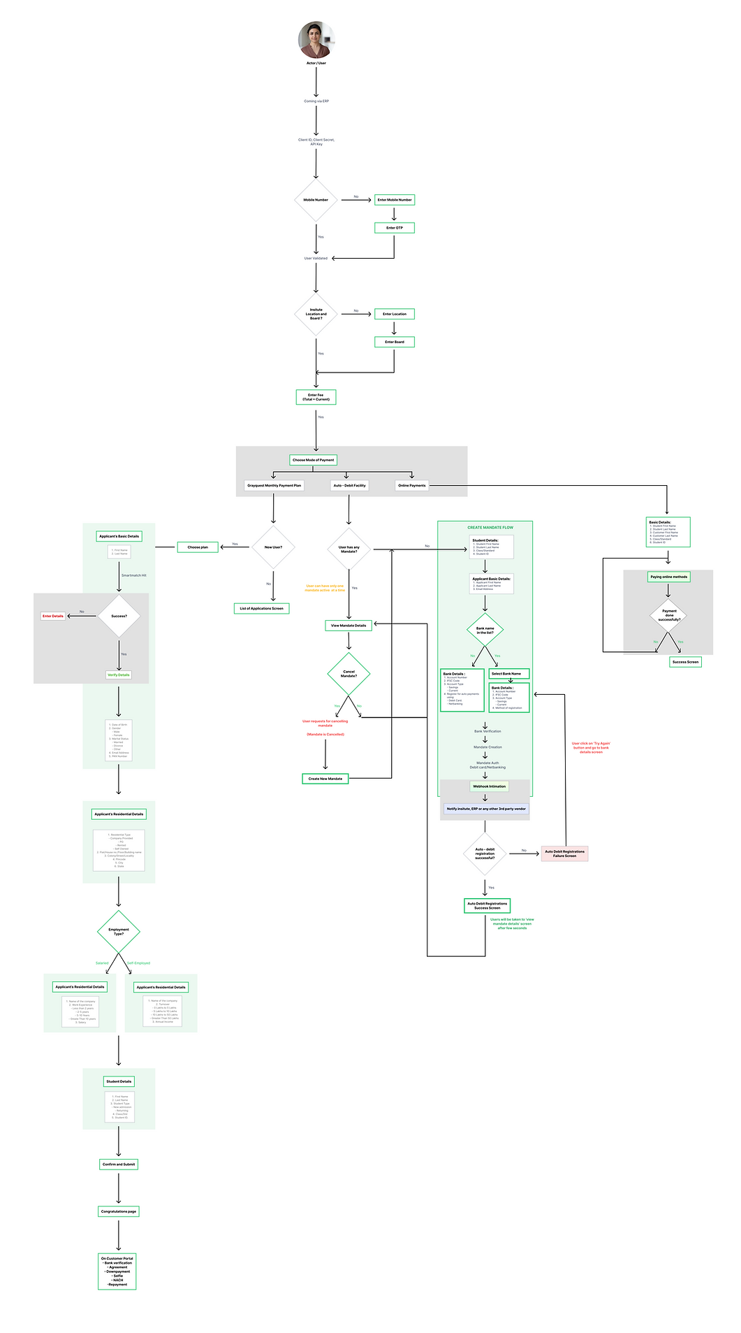
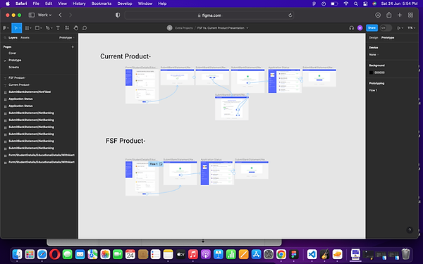
I created Flow after 1st set of discussions
For the design and product team and if anyone needs it in case.
#2 UI/UX Design :
This version focused on the flow and product wise changes - the product team wanted the new service to go to the market quickly.
So we decided to keep the UI design system same and work on the new flow and screens mainly.
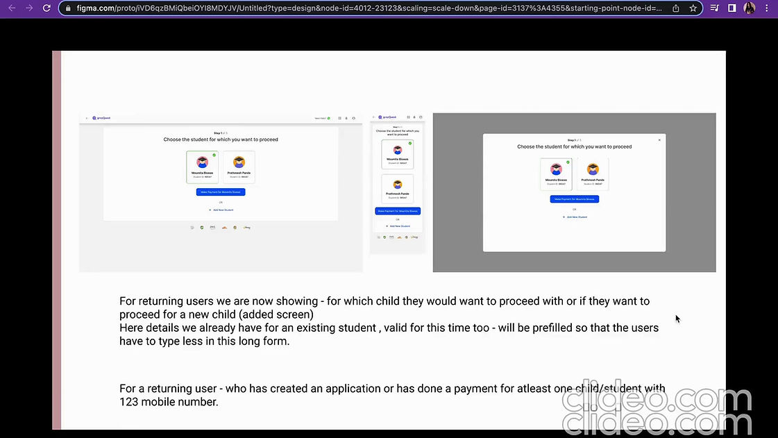
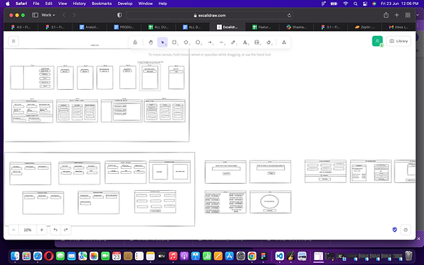
New flow/ screens in the version 3.1 from the version 3.0 .
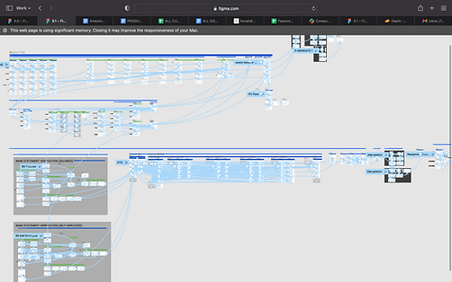
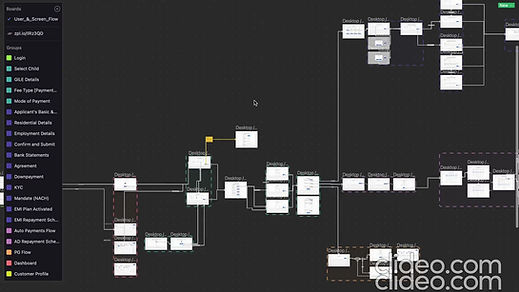
Worked on the prototype and the screen flow as well with one of my team mates
OUTCOMES?
We handed off the designs, design system (same as customer portal version 3.0 but uploaded again on zeplin), prototype and the screen flow to the developers.
Explained the flow and the screens as and when needed, also ideated and discussed on additional thoughts on the go with the developers and the product team.
Next we were told we start researching, brainstorming, discussing and iterating on the customer portal 4.0 - the future of the customer portal like we want!
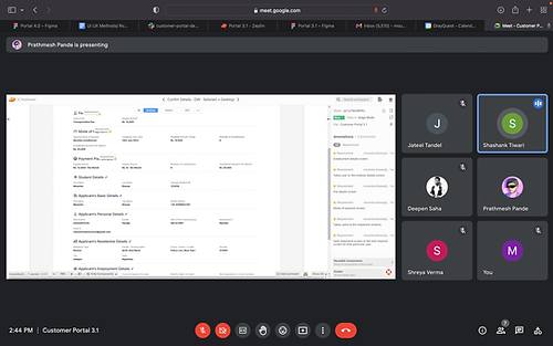.png)
One of the meet with a product person, vice president, head of product, a designer and a developer.
5.
Customer Portal 4.0
Let's Research and Ideate all in and out - like we dreamt of!
Customer Portal 4.0
WHY?
We always wanted to research and design a lot of "out of scope"things too.
Now that we have delivered all the customer portal requirements beforehand (yet the version 3.1 is not live)
so now our product head gave us a go ahead to research, brainstorm and design around different aspects.
So that by the time the tech team is ready with the version 3.1, we can solve other major problems and improve the user experience further.
WHAT DID I DO?
Our Vice President (VP) once said that he wants to to deep dive into the elementary level of the design and experience.
Fascinated by this work opportunity now, I did the following in a nutshell.
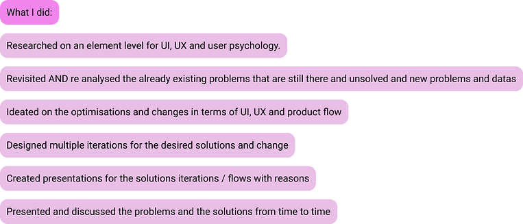.png)
Element level research in a nutshell had:
.png)
UI element level -
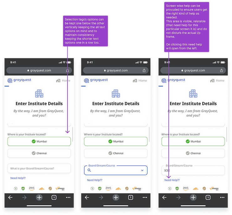
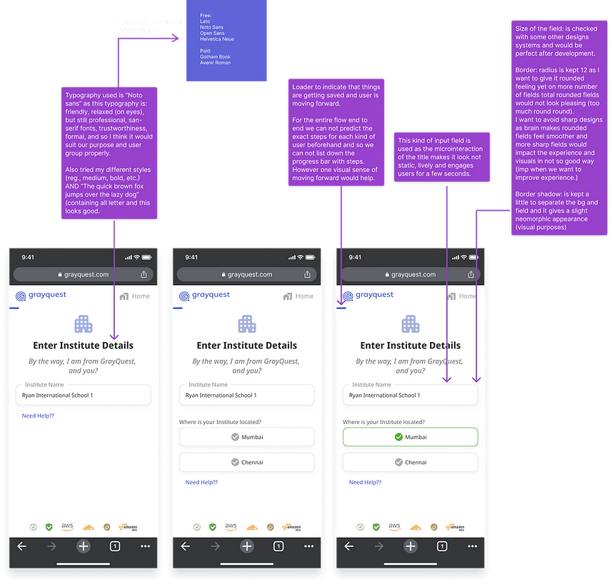
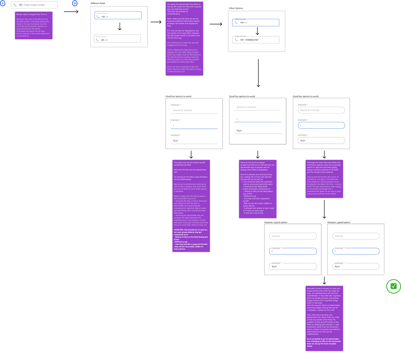
like radius of the field, input field type(underlined vs. boxes, etc.), microinteractions, animations, typography, placements of contents, allignments of the screen content, usage of illustrations, kind of icons (rounded vs. shape), etc. - how each small thing impacts the user experience psychological and thus what would be a good practice for us.
Please keep reading to know this is detail.
#1 Secondary research and Ideation :
This contains:
- Kind of content that should be used/avoided
- Placement of the content on the screen and the overall screen allignment
- Dissecting different the input fields - roundness, type, typography, microinteraction and choice of input fields.
- Problems in not only our product but in the ed fintech environment.
- Changes in the product and how it would work.
- Since some long process can not be reduced after a point - so now how to make users feel the long process is smooth and quick, easy and interesting to proceed with.
- Understanding user psychology and how small UI and UX elements can make or break the system.
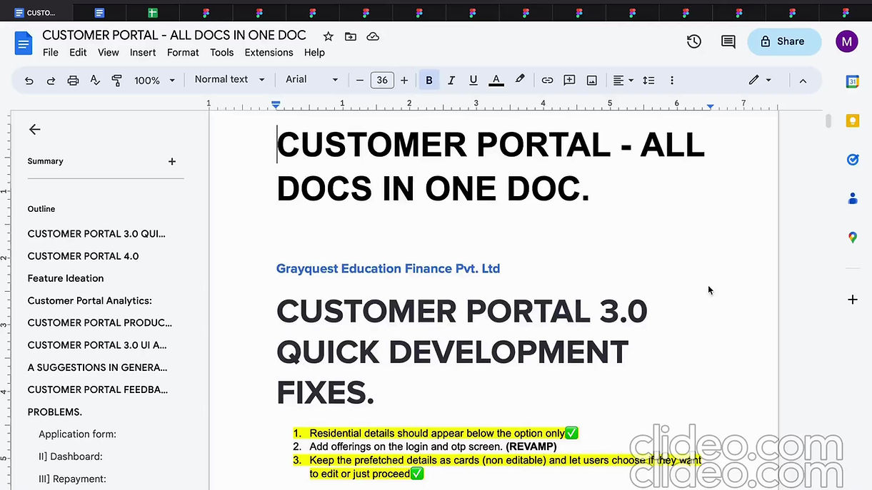
Secondary research in detail.
#2 Analytics :
Analysed different google analytics and superset data to know the metrics of problematic areas and then prioritise work.
Also in a lot of places, the problem seems to be in one area but the real problem can be somewhere else too (examples mentioned below in this same section) and so knowing the data in depth, in and out helps in understanding and solving the problem better and exactly as beneficial.
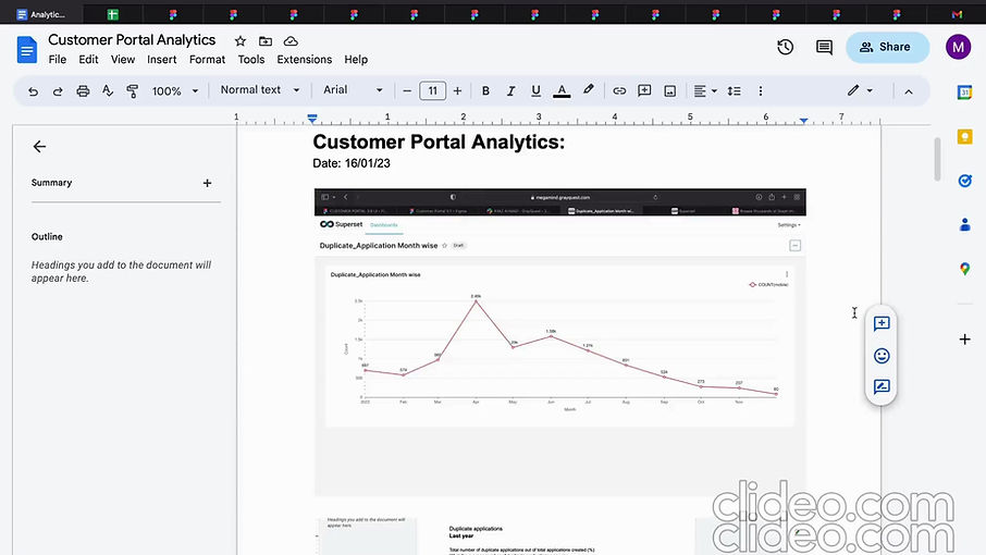
Some discussions around the metrics!
#3 Interview :
Took a detailed interviews of the customer facing stakeholders (overall of more than 20 stakeholders)
then analysed and reported the findings with the team to further get started on it.
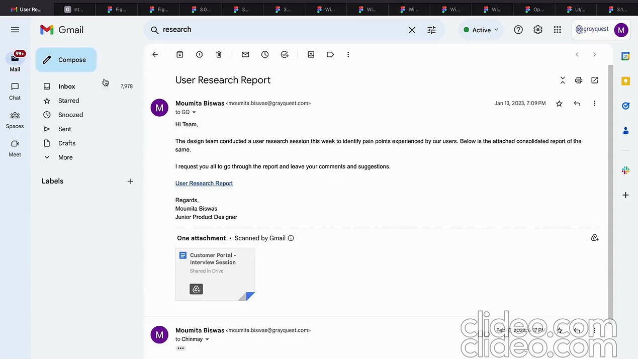
Interview report.
#4 Targeting one problem and finding out the solutions! :
As we analysed different google analytics and superset data to know the metrics of problematic areas and interview datas for the metrics, experience and user behaviour problems and then prioritised our work accordingly - it helped to understand and take up one problem at a time to actually get to the solutions and not taking up everything together and not reaching the goal for some.
Also in a lot of places, the problem seems to be in one area but the real problem can be somewhere else too:
For example,
the applicant's details screen has high dropouts, and possible reason could be asking for applicant's pan number or mismatch of applicant required and the pan card number provided.
Now, we may think that this problem is only in the pan number field -
but I think this is connected to it's previous screen too where we ask for the applicant's name.
There if we can get the right kind of applicant's name and pan number - the issue of pan number mismatch will be reduced.
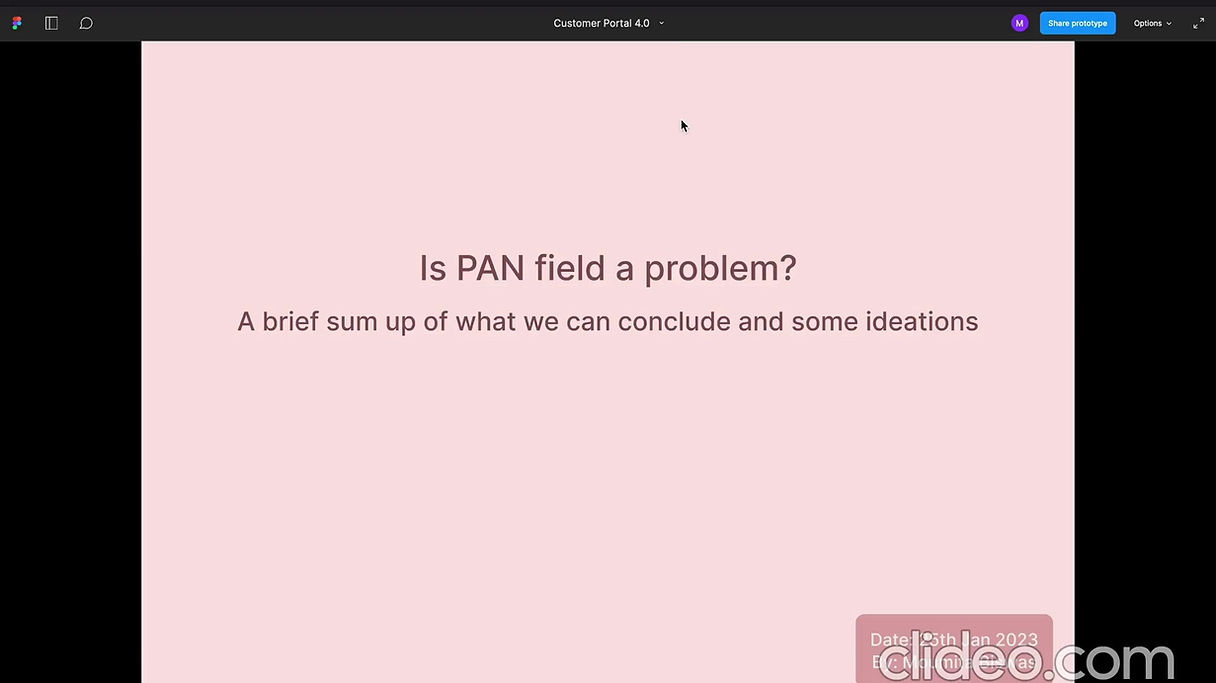
PAN number dropout problem - understanding data and ideating on the solutions.
Example problem 2:
Users often don't understand the "My application cards" - they ask the POC which application card they should click on.
From my research I got to know:
- The tags are not understandable at all
- The next step is not understandable
- The CTAs are not understandable
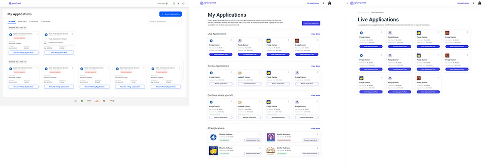.png)
Ideating on the application cards.
Understood the current labels from different aspects and re-writing the tags and CTAs that would be easy to understand
These tags and CTAs were not understandable to our team as well - this is a major problem.
#5 Let's make "thinking on an element level" more visible :
Researched, understood and ideated on element level.
So,
1. currently we show 3 fields in a row and all fields together - this makes the form look too crowded and having a lot of data to be filled.
Here trying to keep minimal required things shown at a time - depended fields can be shown after the independent field is filled rather than showing it upfront and locked- where users can not do anything yet increasing the number of fields users see.
2. The form jumps from one screen to again rather than a smooth transition. That gives users an impression that a lot of screens are there to be filled.
Tried to give a smooth transition by not making it look like the entire page is changing but rather only that particular space is changing in that screen.
3. Not over simplifying the fields by showing one field per page as that would increase the feel of form being long ever more - increasing dropouts
4. Currently, we do not use proper white space. White space helps the form look cleaner thus gets easy to read and understand and also looks breathable - giving users a sense of comfort as compared to the overcrowded screens.
Often clean visuals help in smoother experience.
5. In my research it is found that often users either don't read the content properly or don't understand.
For example - who can be the applicant.
So using the right visuals in catch users attention would be beneficial to get the right data.
Example student icon/ illustrations for student details and if applicant must be a parent then a parent like icon/illustrations besides the title.
6. Using microinteractions in the fields help engage the users a little.
7. Our current screens look very static and thus adds in to the not so fun experience. We can use the microinteractions, animations and smooth transitions from one field to another and one screen to another, to make it dynamic
8. The illustrations and icons can have motion when moving from one screen to another.
9. The loaders and the error screens have a very generic text and illustration - that can be more specific.
For example instead of just our logo moving don't help the users. The text can be changing as per the case letting users know what exactly is happening and how much more time to wait and say a gif showing what is happening.
Example : in case of penny drop verification - a penny can be shown dropping in a valet.
10. We have a z placement, but I/F movement of the eye would help our users read and understand the form better in our case due to the eye movement plus the minimal contents and more white space.
11. We do not even show the progression from one screen to another.
Detailed or just a rough sense of progression helps in:
-long forms to give a sense of progress and how much more to go
- where the details are not so common and the form is long - user would get a sense of relieve to know that their data they are filling is getting saved as they proceed.
The details progress bar was not possible in our case since depending on each step and the user, the further steps change.
However providing the possible documents needed before hand can have a pros and cons:
pro- user would know beforehand the data they need, to arrange it and not leave the system at each step.
con - the users may think the other methods to be simplier rather than filling so many details and gets scared in the starting only.I have work on this ideation, which you will find below.
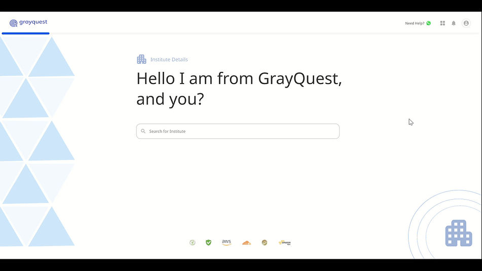
Customer Portal - Iteration 1
This iteration has a center alignment with minimal other elements shown on the screen.
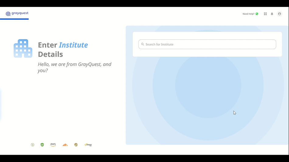
Customer Portal - Iteration 2
This iteration has a right- left placement with:
- the contents we want the users to read being on the left
- the fields users have to actually enter being on the right.
I found in my secondary research that the brain traces from left to right and focuses more on the right, thus first reading the highlighted content properly and then focusing on filling the content.
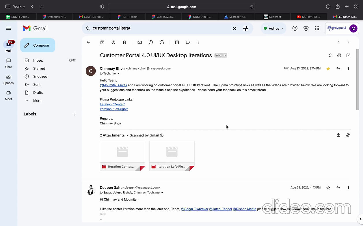
Taking feedbacks example.
Took some feedbacks on emails (to the team)
some by meeting them and showing (to the team and user group participants)
Some usability testing notes.
Did a little A/B testing and usability testing with (as and when needed) :
- our customer facing stakeholders
- team and product team
- user group participants
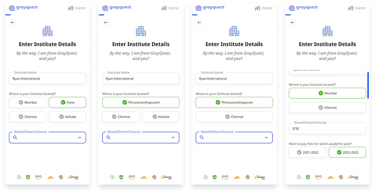
Customer Portal 3.0 (current live version ) on mobile browser.
My Customer Portal 4.0 Iteration
(to improve the user experience)
The current browser shifts a lot when clicked on a field, if we can rectify it in some way to make it static (informed it to the development team)
The current form is long and so trying to make users focus on one field at a time.
Currently, when a field has some error - the system does not take the users to that field and if the user is at the button, trying to proceed but couldn't -> the user get's confused as in what went wrong. (have informed the development team to take the users to the error field to properly guide the users.)
In this iteration, if the user fills something wrong, it will be shown on spot.
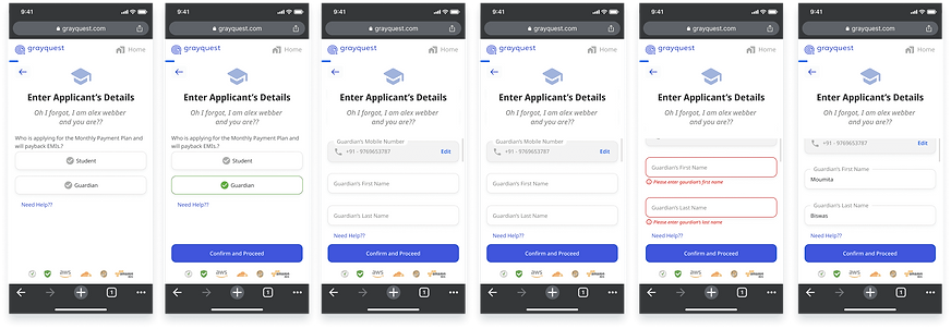
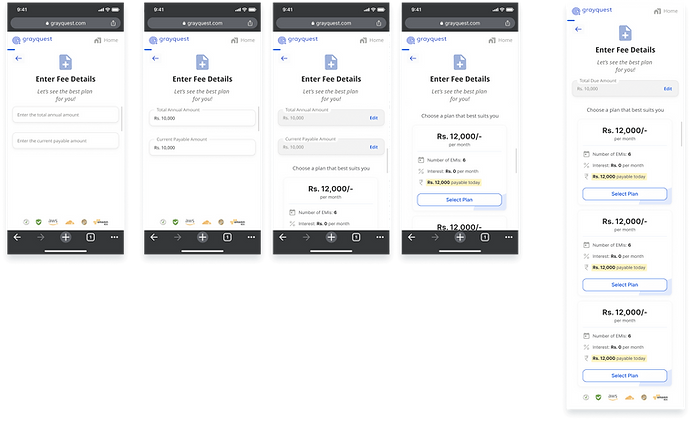
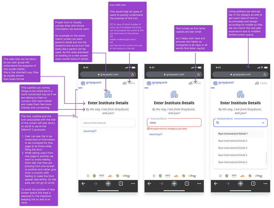
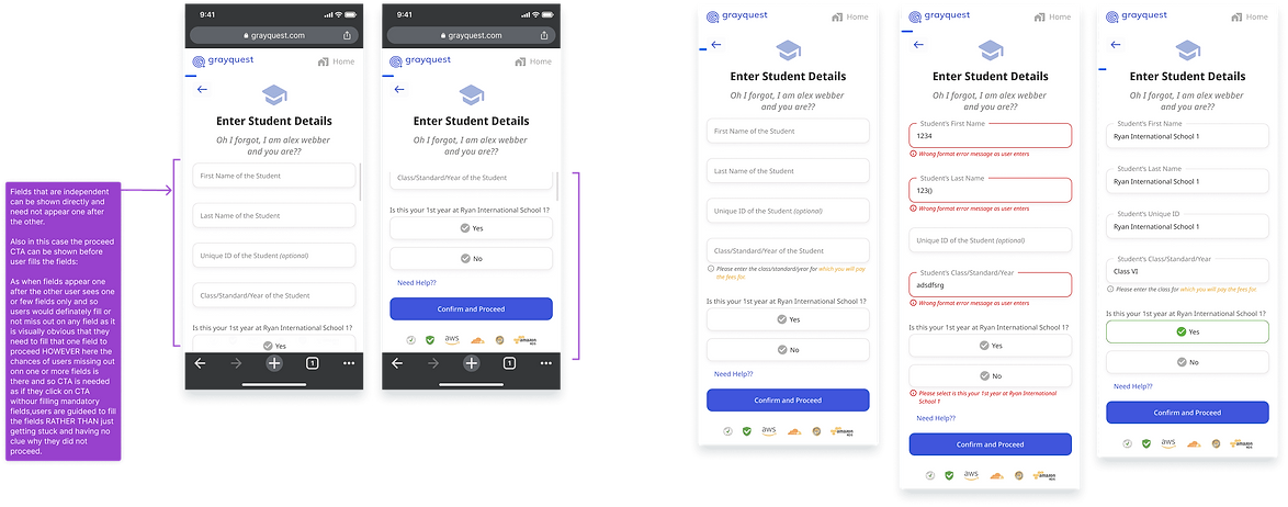
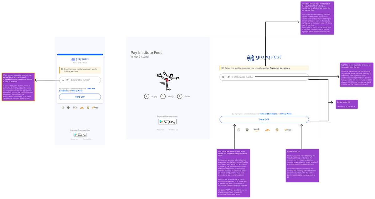
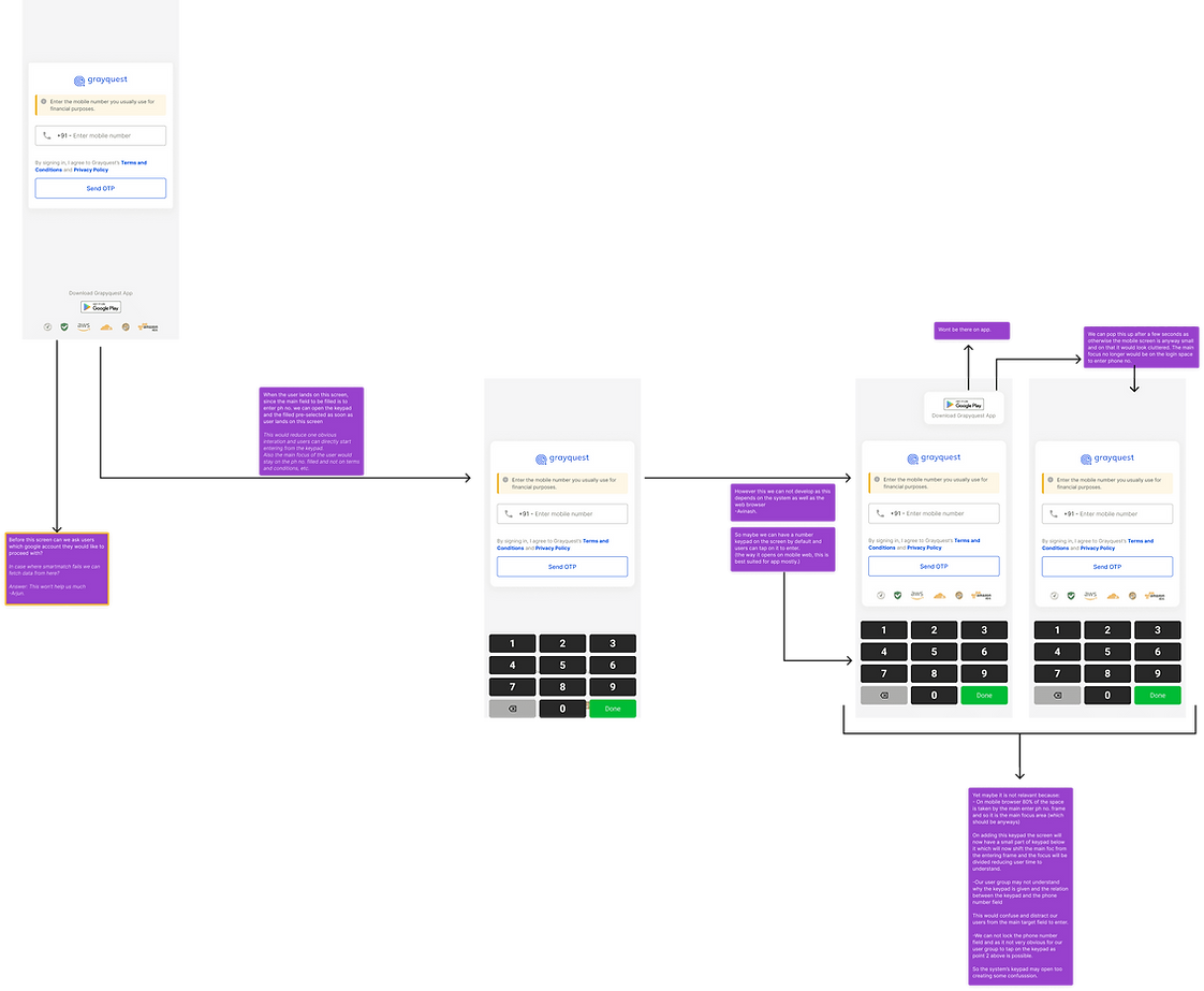
Below are some of the screens and my element level research and decision making.
.png)
.png)
.png)
.png)
.png)
.png)
.png)
.png)
.png)
.png)
.png)
Element level decision making I did.
.png)
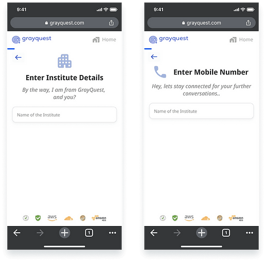
One more example of A/B testing.
slight change in the placement of the icon / illustration also makes difference.
So,
- saving space for the right content to fit screen the users would see first is important.
- also in the mobile browser, as the user taps on a input field, mobile keypad would open from the bottom and thus take up space.
In the A/B test - option 1 got a better response.
probabaly due to the fact that the back button already is taking gap some space and so that is well balanced with the Illustration.
Yet it was conducted on a small level and needed more A/B testing - due to other requirements as informed by my manager, for now it was paused with these results which I forwarded ahead.
.png)
.png)
.png)
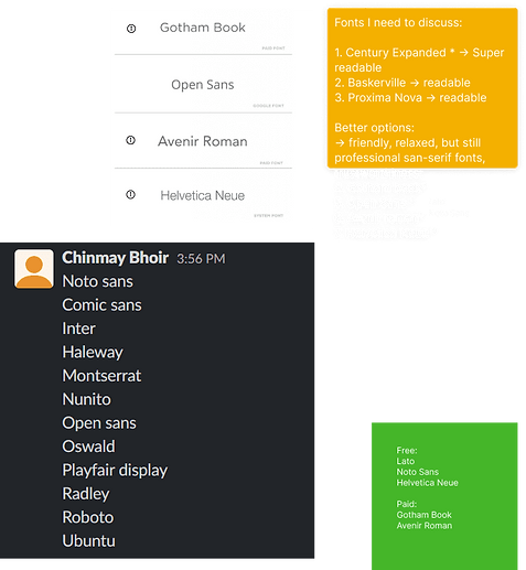
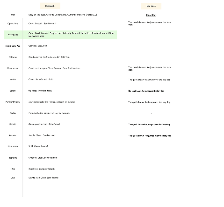
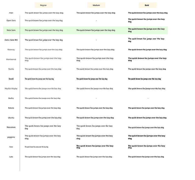
Researched on the typography.
Typography impacts the user experience too by the feel it gives.
Keeping our user group and the long form process we have, we need our users to feel mainly:
- relaxed and easy on eyes
- trustworthy
- easy to read
So reaching on the typography was important.
example animations and smooth transitions to show important things to be noted rather than only text - which we found users often avoid or don't understand.
#6 Rethinking the product flow :
I was also told to rethink the product flow, not necessary for a product to work in a same way always - different use cases, personas and edge cases may have diffrent alterations and requirements.
Customer Portal Product flow research and ideations!
Customer Portal - All use cases journey.
Customer journey ideation simplified.
All the above research, ideations and solutions I came up with,
I discussed it with the design team, product team or the developers from time to time.
Things are taken ahead and noted by the team for the future implimentations as per the priority.
6.
SDK
Where ~80-90% of the customer come to!
SDK
WHY?
SDK is similar to the customer portal with some flow and service changes and entirely different UI than the customer portal, so I feel it is a little similar project - with some points to the remembered while working on it.
Earlier than this, no was was assigned to dedicatedly see the SDK.
SDK is too important for the revenue and thus is on the high priority now.
As I got the SDK work, I was happy to work on SDK.
WHAT?
- user personas and journeys
- bugs
- ideations and solutions
- ad journey work
As a result,
- A lot of critical bugs and issues were solved on time - positively affecting the business
- A lot of ideas were implemented to the user and product problems
- A lot of the solution ideas went forward and will be worked on in the future.
#1 Revisiting the entire SDK journey AND user journey flow:
We created 4 personas and defined it well.
Then I took each persona on mind and revisited the entire SDK flow - noted down the possible pain points that particular user would have - in terms of experience, visuals and product flow as well.
User journey flow - with problems and pain points - also the experience in depth
#2 Getting and reporting bugs:
Although the QA testing team checks for bugs, as I visit the flow, I often find both minor and critical bugs and issues,
As I get problems - I report it to the team and ideated and mention the solutions when needed.
The teammates called me the bug finder to find unique bugs missed out often!
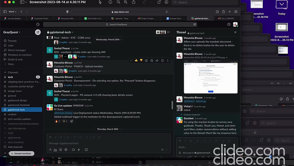
Some reporting issues to the team.
#3 Ideating solutions on the issues :
Noted down all the issues and ideated and came up with solutions.
Prioritised the problems and the solutions, which team should probably work on it, how long would it take to be implemented, etc.
Then discussed my problems and solution ideas with my manager.
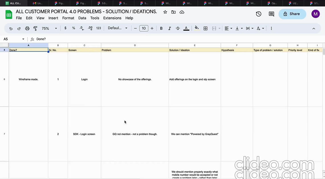
Noted all the problems and and ideated on the solutions.
Also prioritised things.
#4 Worked on and designed urgent and high priority work on the SDK :
As and when there was a call from the vice president or anyone else in the team on some high priority designs and content needed on the SDK, I did my assigned work.
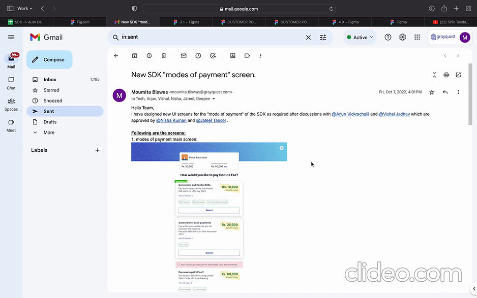
Designed the selecting the modes of payment screen (important business point of view screen), discussed and approved by the vice president.
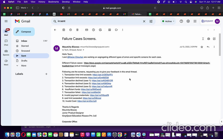
After unsuccessful payment, we didn't show :
- the exact reason why it failed
- steps to avoid or keep in mind to not repeat it, if any
- screen was very generic
- CTA was generic.
So, I with discussions with one product person and other team members:
- Kept separate Illustrations indicating the problem - to visually help understand better
- Added proper guiding text - with exact reason
- Changed the CTA as per the error case.
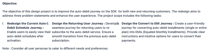
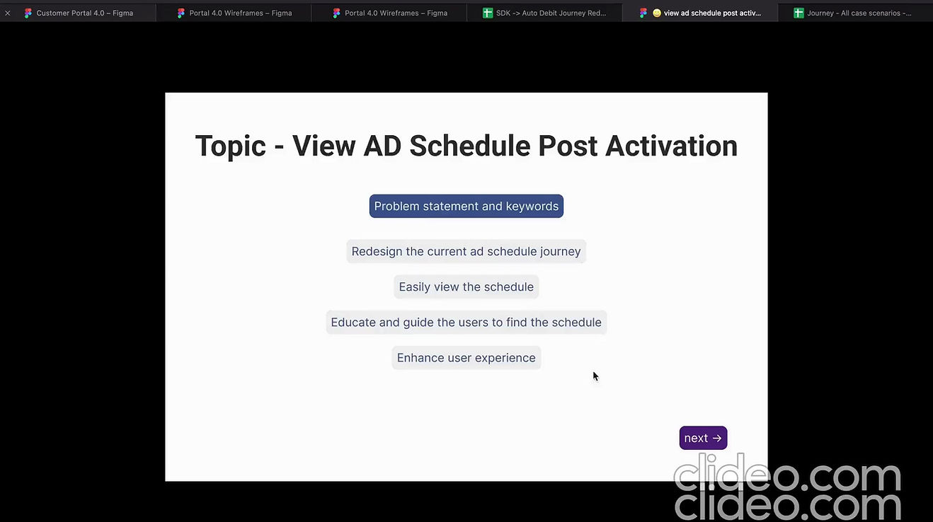
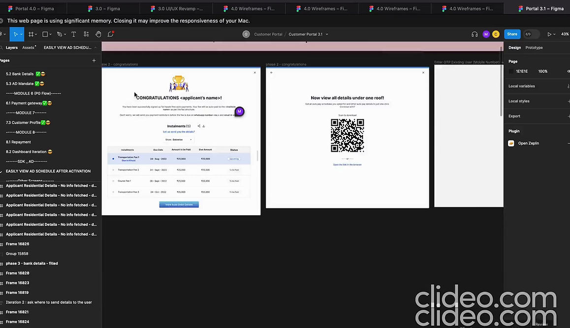
#5 Got some problem statements on Auto Debit on the SDK to work on too :
The auto debit of the SDK is not something a lot of people work on, needed to work on that now.
The main objectives in a nutshell:
.png)
7.
Other Ad - hoc tasks
Worked on other projects other than the customer portal and sdk.
Other work
WHAT?
Apart from the customer portal and SDK, have worked on other priority work like:
- Sales work
- Fee management system
- App
- other research, helping and discussions
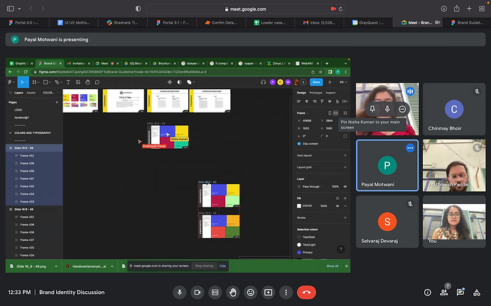
Helped research, ideated and discussed on the graphic side with the design team like on brand guidelines, colour, typography, etc.
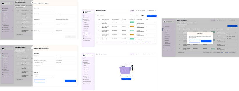
When Fee management system was on high priority - helped my team mate with the design team and designed some of the modules and prototype all the above modules.
.png)
Just a few fee management system screens .
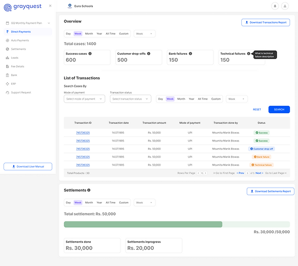
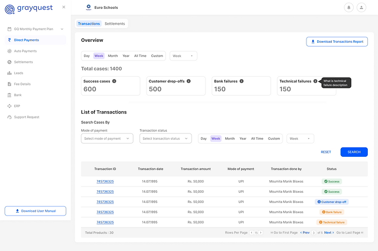
Some examples of the screens
I designed this screen for fee management system on priority
as needed by the team.

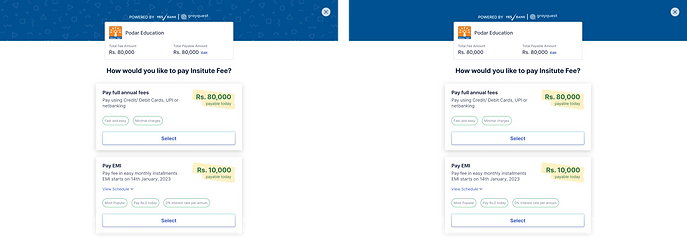
Some examples of
urgent sales requirements I worked on.
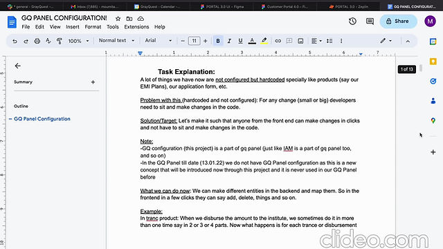
An example of GQ panel configuration work done by me.
Properly documented the understandings and discussions with different stakeholders.
%20(1).png)
Reflecting some customer portal changes on the app too and
also discussing on the app with the design team.
Helped a team mate with his error codes forming.
bottom of page