top of page
LoveNote
Begin a forever story
A companionship app to the next level, a little deeper.


My Role?
UI/UX Designer
Graphic Designer
UX Researcher
Team?
Group of 7
- 2 UX Researcher and UI/UX & Graphic Designer (including me) +
- 1 Project Research Scientist+
- 2 App Developer +
- 2 Web Developer +
- 2 Content Developers
Tools?
Figma
Canva
Jotform
G Meet
Project Type?
Internship
Timeline?
10 months
(Feb 2021 - Dec 2021)
Company?
IIT Bombay
Overview:
Hello Readers! Welcome to my "LoveNote" Case Study
A "perfect" place to work for me is the one where you get to learn, share, experience and connect- A LOT and this internship proved to be one such awesome experience for me. So here I am, sharing one of my awesome internship experiences!
A short story of my IIT Bombay Internship 2021- Project LoveNote, where I worked on a companionship app- from research to implementation and beyond!, met a bunch of amazing people, learned a lot and experienced to the fullest.
Overview
But, Why this Project?- THE “BIRTH OF LOVENOTE” :
So THE PROBLEM was:
In this new trend of swiping left and right, we are somewhere missing the deeper meaning of love and life partner. Compatibility is being neglected as people choose different ways of being introduced quickly to potential matches, resulting in failed partnership and/ or time wastage. We deeply noticed how a large population is unsatisfied, unhappy and unsuccessful due to this and so we researched and analysed the whole user experience of selecting a life partner and how this modern methods have caused trouble to people all around the globe.
People don’t “fall” in love, they “rise” in love- but nowadays this journey of finding that love has just turned into a race of swiping right which leads you nowhere, trapped in a puzzled circle. We understand how important a healthy relationship can be to multiply your strength but this forest is too dense and dark which affects your potential to be happy and successful.

THE SOLUTION:
This is a huge problem indeed and so we thought of working for a better choosing and selecting experience- not completely based on looks but majorly on their characteristics, nature, and compatibility, taking it not too fast and not too slow and trying to provide our users a safer environment, being our vission and mission. We don’t want our users to madly run in the race of swiping left or right but we want them to choose calmly, safely, more thoughtfully, taking users at their own pace and in a fun way- decide their “the one”

Hence no more worries, LoveNote is at your rescue!
Show Time!
Enjoy the videos we created to understand our solution better :)

Sneak Peek into the app and the website , I hope you like it:
"Keep reading to know our journey!"
-Me :)
But, how did we reach to this stage?
PROCESS, THE JOURNEY:
1
A
SECONDARY RESEARCH:
Me and my team started off by firstly understanding, researching and going through several articles, videos and similar materials about the topic to know, understand and feel the problem in this domain.
RESEARCH & DEFINE:
Secondary Research
WHY THIS STEP?
We started with secondary research because- we belief that to start any project, to solve a problem (small or big) it is necessary to understand the problem, why is it even a problem! and what is going on in that domain, how is it affecting its users, and so on, so secondary research is a great way to get started! Self reading, researching and then discussing on it helps getting information and understanding about the domain in depth, feel the user pain and then work on it better!
OUR OBJECTIVE?
Here our objective was to- understand about the domain- dating, commitment, compatibility, the problem, how things here has evolved over time, user practice and experience and the results, and everything related and necessary about this topic - and then start the project in the right possible path, to find the right possible solutions.
WHEN DID WE DO THIS?
So this was our starting point, in the first week of our internship- from day 1!
INSIGHTS WE GOT?
TYPES OF INSIGHTS WE GOT?
DID THIS HELP US?
This step helped us getting started in an effective way as by now we understood the ratio of unhappy and unsuccessful people in the world in this matter, key things that are important, grave problem that exists, things people are possibly doing wrong and what is the market and peoples approach missing- This helped us feel, understand and know the problem before dealing with it! by helping us dive deep into wrong and right things that exists in searching, compatibility and commitment
TO ANALYSE-
To analyze after researching, I and my teammate had a meet where we explained each other insights we got, we divided the entire document into different sections and brainstormed on things we can probably work on and then after some more similar discussions, we had another similar discussion meet with our sir where along with discussing on these insights we also discussed on what further steps we can take that might work.
SO WHAT'S NEXT?
After taking these insights we wanted to understand a little deeper, what things are going on in the market already, where is the gap in the market, what things should be provided for better results but aren’t provided and vice versa and how much problems existing features are able to solve, how do they work.
So we planned to conduct competitor’s analysis for next few days.


Evolution of people dating, committing and getting into a companionship and why is a companionship even important?
Rate of successful companionships, problems faced in short and long term, why don’t dating apps and common practices/ approach work and in what scenario they don't work?
What do people think of successful companionship and different forms of commitment, what is the psychology behind different kinds of people, their styles of selecting their partner, their compatibility factors, why do they behave the way they behave, also what are the different types of compatibilities and how does it work? , attachment styles and the factors affecting them.
Probably what would a different kinds of healthy person think of relationships, what do they want?, their expectations? and the reality that they are served?
Personality types, how is it important in determining compatibility, how accurate are they
Personality and compatibility finding tools that are there these day, how accurate and useful are they, did these methods actually help people in the past.
Possible right mindsets and approaches to find compatible people, for a successful companionship
What things to consider and what things don’t usually matter while choosing a life partner
What factors play key role on a deeper level for compatible companionships and where today’s market is standing- what are they serving and what are they missing, what affects does it have on the world
Researching & Important Insights
(Blurred due to NDA)
B
COMPETITOR’S ANALYSIS PART 1:
We wanted to understand what things are going on in the market already, where is the gap to effectively be able to solve existing problems in this domain and improve user experience.
Competitor's Analysis Part 1
WHY THIS STEP? & OUR OBJECTIVE?
Next we conducted a small competitor’s analysis. Here our objective was to understand what things are going on in the market already, where is the gap in the market, what things should be provided for better results but aren’t provided and vice versa and how much problems existing features are able to solve and how do they work. So we planned to conduct competitor’s analysis for next few days.
WHEN DID WE DO THIS?
Just after secondary research- this took us a few days! on week 2 (as this competitor's analysis was done partially as needed and required at this stage, and we resumed the remaining competitor's analysis as required later)
TO ANALYSE-
To analyse we created an excel sheet to maintain all the findings properly, gave color codes and separate columns for useful, problematic and neutral features in the market and regularly kept meets to discuss insights and what we think of these features and practices done.
Competitor's Analysis
(Names are blurred due to NDA)
BUT THEN, WE REALIZED
We realized, we must also conduct user interviews now to understand and connect with users even more, talk to them directly. So now this much competitor's analysis is good to go and remaining can be done better after conducting user interviews.
DID THIS DECISION HELP?
Little competitor’s analysis that we did is good for now as it helped us understand the market and what is going on here- so this and the secondary research we did helped us connect and understand our users during the user interviews better as we now know something about the matter and the rest we will understand as we go. Rest i.e. to understand what feature is good, neutral, not so good for our users and to brainstorm on it- we need to listen and connect with our users directly for better solutions.
SO WHAT'S NEXT?
Conducting secondary research and competitor's analysis we got insights that are really very wide and so although these helped us helped us understand the domain and the market deeper we now had to narrow down to the points we need for this project, detect top problematic areas to focus on and reach to a valuable solution- this being my reason 1 and 2 being that for now we had sufficient benefits from competitor's analysis and rest i.e. to understand what feature is good, neutral, not so good for our users and to brainstorm on it- we need to listen to our users directly.
So we planned to resume the remaining competitor’s analysis after user interviews as required.
So next is user interviews!
UserInterviews
C
USER INTERVIEWS:
So after this we planned to pause competitor’s analysis for now and start user interviews, talk to users directly!
We conducted the user interviews by- (1 method for each participant)
-
On meet
-
Telephonic interview
-
Physically meeting
HOW DID WE START THIS?
For this we first discussed what should be our motive from this user interview and overall for the project and then we started framing and discussing on the questions we will ask. We kept questions both general and more specific- most of them being open ended questions, follow up questions and then arranged the questions according to the priority, depth and psychology of when and why people answering more deeply, effectively and thoughtfully at certain stage of the interview (we think most users tend open up more and more as we discuss as it makes them comfortable over time but too long sessions will start reducing their efficiently to answer properly), questions that were very similar and might take discussion to the same path- we merged them for not keeping too many questions in the starting phase as it might exhaust users affecting their quality of answers. After finalizing the format and the questions we started inviting users through social media, contacts and their contacts.
TO ANALYSE-
Then to analyse we conducted meet with my teammate to discuss the answers, group them, understand them and then documented it- we divided the insights, helpful and needy things into phases, then discussed and presented all these to sir along with discussing what can be done further. Now from the pool of answers, we had to narrow down the things we would need and focus on by understanding the answers in more depth, narrower and more focused. Our Sir also helped us understand edits we can do to our questions, in what direction should we ask in our next user interviews keeping the previous answers in mind to get a better, direct, deep and more appropriate answer for our study so that when we analyze we understand and get what we exactly would need and so on. We then discussed and revised the questions a little as needed for next interview round and resumed our user interviews.
HOW DID WE CONDUCT?
We conducted the user interviews by- (1 method for each participant)
In case of virtual and physical meeting I focused on their answer, their words, their voice, how easily or thoughtfully they say, how freely they answer, their facial expressions and their body language.
However in case of telephonic interview I could focus on everything but their expressions and body language which was a con however something is better than nothing and this was for those participants who wanted to help but could not manage to meet or are not comfortable showing their faces which is a pro point!
OUR MOTIVE & OBJECTIVE?
Here we wanted to talk to different types of users directly to hear, see, understand and feel their opinions, experience, pain points- what they are doing, what is working for them and what is not working for them. To get more detailed and focused answers and to get valuable set of data that we can use, to understand and emphasize with users- to know what is going on in this field from user's point of view directly and how they feel about it. Also this would help us focus on certain user groups, features, problematics areas and come up with more focused and stronger solution.
DECIDING USER GROUPS:
We had 2 phases of user interview at this stage in which in total we invited 40 participants (20 each one of us) and divided them into these 2 phases interviews (some participants were willing to help us in both the phases, so they were invited in both)
During phase 1 we invited all age groups- mainly above 20, any gender, any marital status but compulsorily frame of mind being serious relationship.
This is because our primary goal in user interview 1 was to understand and empathize with serious relationship minded people of eligible age.
During phase 2 we invited the following user group-> Age- 25 and above, Marital status- Single, Nationality- Indian, Frame of mind- serious relationship.
This is because after phase 1 user interview we discussed all the insights so far and then what problem and user group we must focus on- to work on and deliver better solutions. So phase 2 user interview was more focused one.
On meet
(Virtual meeting)
Telephonic Interview
Physical
meeting
WHEN DID WE DO THIS?
This entire user interview phase 1 and 2 continued for 3 weeks 5 days- this consisted of not only user interviews but working on other necessary work for user interviews like documenting, discussing, analyzing and understanding along with collecting important and much needed user opinions as well!
INSIGHTS-

Questions
(Blurred due to NDA)
.jpg)
Responses
(Blurred due to NDA)
Insights
(Blurred due to NDA)
Points to improve and change in next phase
(Blurred due to NDA)
.jpg)
C (1)
USER INTERVIEWS STAGE 2:
We then needed more users for our user interview and at this point, after analyzing and then discussing on who our target users are going to be- we now had to narrow down our user group for user interviews as well.
OUR OBJECTIVE?
Now our objective was to get our target user group’s opinion on some crucial topics in particular, their experience, pain points, opinions, what works and do not work for them in general and getting their opinions and response on notes we highlighted from our research done so far in depth as we understood that working on providing solution for a wide user group can be difficult, a little impossible and might not be effective, so it is very crucial to define your user group before starting further steps. We needed the following:- age group 22-40, frame of mind- serious relationship, marital status- any, nationality- indian.
WHAT DID WE DO?
For this we first started researching on how to find more participants for the research, researched and created list of “user traits and where to find them”, created our different user groups i.e. personals for better division thus researching, ideating and coming up with solution that works strongly for the user group we are focused on, made posters, created user discussion form and survey form to invite participants for our study. Also we researched on different ways we could source our diverse users/ participants like research panel, cold emailing, etc.
Creating survey and user discussion form for user interview
(Blurred due to NDA)
Questions and points to remember
in user interview
(Blurred due to NDA)

.jpg)
.jpg)
.jpg)
.jpg)
Posters for user interview
(Blurred due to NDA)
.jpg)
.jpg)
.jpg)
Deciding on user group and some of our focus points for user interview phase 2
(Blurred due to NDA)
LET'S ANALYSE!
We kept meets with Sir too in between the user interviews and these steps to discuss which method might be good and when, approach we should take at each step, discussing on different personals and their responses and noting every useful piece of knowledge we should go ahead with and when we should use that piece of information. In general too we had several rounds of information editing and discussions for posts, posters and video, website, app, posts, presentation, etc. (that will come later on)
CHALLENGE I FACED HERE!-
This reminds me of one thing, 1 thing (out of few) that was a challenge and I learnt from our sir (throughout) was that sentences you frame for your users say on posters, posts, app or on website can make or break your product too- it has a strong impact on our users and so you must know how to frame your sentence in such a way that it is not only simple, easy and direct to understand but also connects users emotionally.
We had several rounds of information editing and discussions for posts, posters and video, website, app, posts, presentation, etc. (that will come later on) in terms of what words we should use. I personally learnt a lot and can improve a lot more!
INSIGHTS:-
From this entire user interview we got huge insights as in what each user group's opinion, experience, pain points, grief, thinks of dating, companionship and commitment both online and offline nowadays.
WHAT'S NEXT?!:-
Due to 3 reasons we decided to proceed to Flow Model, User Flow, some more competitor’s analysis next.
So let's make some models to understand and discuss and also do a little more research as needed so that we can take a step towards the "Ideation"
Insights
(Blurred due to NDA)
D
FLOW MODEL, USER FLOW AND COMPETITOR’S ANALYSIS PART 2:
From the previous steps we wanted to understand the user’s interaction with others, understand different user scenarios and flows, categorize the interviews and for brainstorming sessions, know about the market and compare their features in a little more detail based on the information we have
Flow Model, Usr Flow, Competitor's Analysis part 2
WHY THIS STEP?
To solve a problem, we should know not only the problem but also the users for whom we are finding the solution in some other important aspects too. Partially we now know them emotionally and mentally, know their attempts and interactions with dating apps from previous steps but we need to know some other crucial things like their interactions with others, different user scenarios and flows, different possible user journey doing/trying to do interactions.
That would in turn help in brainstorming for the right problem's solutions, right and effective solutions in the right way.
The solutions that we will come up with must also be having a proper realistic flow keeping in mind not only what is good for our users and what we can implement but also user's flow, interaction and other such user related scenarios.
So due to these 3 reasons we proceeded to Flow Model, User Flow, some more competitor’s analysis as-
Flow Model- To understand the user’s interaction with others
User Flow- To understand different user scenarios and flows, thus categorize the interviews and brainstorming sessions
Competitor’s Analysis 2- To know about the market, to understand and compare their features and it's impacts and the gap in the market in a little more detail after knowing the situation and the problems of people and dating app market and it's impact on it's users so that we can brainstorm better on the problems and it's possible solutions.
INSIGHTS & DID THESE STEPS HELP?

Main Categories of dating apps (Blurred due to NDA)

Flow model

User Flow
.jpg)
Competitor's Analysis (Blurred due to NDA)
So now we are clear about quite a few important things and ready to start the ideation phase, as-
- So now we clearly know different things, people and team our users are going to have interactions with and vice versa and different actions each one of the above performs during the process of finding match, choosing, dating, understanding, deciding and committing to the one.
- We also now clearly know what will be possible different user scenarios and flows during this entire process of committing to the one.
- We now know about the good and not so good features and practices in the market nowadays to the fullest from all important aspects, to help us brainstorm and take decisions later on the right problems and possible right solutions, in the right way.
- We can now also track the possible right problematic areas that we should work on from these models
- We can now think of the right, realistic, possible solutions that would work for users seeing these models as we will follow the different possible user scenarios, user journey and user interactions
- We can now categorize the interviews and brainstorming sessions according to these different users as seen in these models and proceed with our further steps
- In future this can be used to explain developers and the team about our solutions.
DISCUSSION!
After this I had a meet with the team (me, my teammate and our sir) to discuss the findings, the models we prepared and about the insights and then to discuss further plans and some features we can keep and avoid seeing the problems that exists.
HOW LONG?
All these 3 things took 4 days (in week 6)
Let's start the ideation phase! So next comes brainstorming.
WHAT'S NEXT?!
2
E
BRAINSTORMING VER 1.0:
Let's start the ideation phase,
Let the thoughts flow!
IDEATE:
Brainstorming
WHY THIS STEP?
I think brainstorming is a very strong way to generate ideas and get some extraordinary solution to the problems. Since in brainstorming sessions members can think freely, give any random idea that comes to their minds, I think it let's members think out of the box, help get ideas which was otherwise maybe neglected for being either too simple, too complicated to implement or too imaginary to be true- these ideas either turn out to be the solution that we all we searching for or gives way to some new creative idea we never thought of as even those ideas to be neglected are given attention and thoughts. Because of high number of ideas even if most ideas just go in vain, I believe that highly helps in choosing and deciding the better solutions over other ideas and helps understanding the depth of better ideas in comparison.
WHAT DID WE DO?
We started with several brainstorming sessions- first few with my teammate and then few with my teammate and my sir using miro and google meet

Brainstorming ver. 1.0
(Blurred due to NDA)
INITIALLY WE HAD PLANNED TO,
I think normally brainstorming sessions are conducted among the team members however initially we had also thought of also keeping brainstorming sessions with different user groups to understand there frame of mind, thoughts of real problems based on dating and companionship experience these days, in which direction their thoughts go in this aspect and so on. For this we had initially created 5 different user groups to get insights on different aspects, groups were as follows:- 1. Users that have experience with dating apps, 2. Users who don’t have experience with dating apps, 3. Psychology knowing people, 4. Design background people and 5. People experienced with relationship and (or) marriage. However we later decided to not go with this
WHY DID WE AVOID PREVIOUS IDEA?
We did not execute the plan of keeping brainstorming sessions with different user groups as said due to the following reasons- 1. We already had taken enough insights for now from all these types of people and can take more as needed later, 2. We did have enough brainstorming sessions amongst us and will have more later depending on in detail brainstorming about the features and ideas selected, 3. We will have to then test our ideas and for that we need to go to users, that would be a better time to approach them again as we will get in detailed insights on things we are planning to go ahead with.
DID THIS DECISION HELP?
This did help us save our time and energy on the right process at the right time.
DID THIS BRAINSTORMING SESSION HELP?
This method did help us get huge number of wide range of ideas worth thinking and discussing on in the later stages, opened doors to unique and powerful solutions to the problems we want to solve. This long brainstorming session had discussions and thinking about everything right and wrong, good and bad about companionship and matching practices people follow. This overflow of thoughts opened doors of positivity to find a unique, extraordinary and powerful solution to the user pain points and the grave problems they face.
WHAT DID WE DO AFTER 1st BRAINSTORMING SESSION?:
After 1st Brainstorming session with my entire team then (me, my teammate and our sir), I and my teammate had several other brainstorming sessions and meets to discuss on the ideas, some more follow up ideas- their possibilities to develop, possible impact on users, and so on. We then came up with features that would help users and may be implemented.
WHAT DO WE CONCLUDE NOW & SO WHAT'S NEXT?
Although we came up with features that would help users and may be implemented and although the thoughts and ideas were ours, towards the end of the session seeing the miro board it looked like a huge hub of all possible features good to be added. It was not ideal to make an app that provides you with everything you need and want, not focusing on few particular things as it makes all possible things available but not to the best and so due to focusing on all at once nothing gets implemented to the best, also so many features makes users get confused as in where to focus and thus their user journey gets disturbed and they either become less focused for what they are on the platform or just quit the platform and moreover a lot features becomes a little too impossible to be implement. Also a lot of ideas felt like its already existing therefore the originality is getting lost somewhere. From this huge pool of ideas and features we shortlisted we now have to brainstorm, discuss and thus choose our main USPs.
So now we had to refine the ideas, select our USPs and brainstorm more on those USPs.
F
BRAINSTORMING VER 2.0 (A & B) AND
CREATING USE CASES:
We had few more brainstorming sessions amongst us to refine the ideas and selected features, select our USPs and brainstorm more on those USPs.
We also categorized our USPs into different sections as it will be on our application.
After finalizing USPs we created use cases and real world scenarios for those features to understand it's flow and real scenario to implement it better and make better decisions on it.
Use Cases and Real Wold Scenarios
WHY THIS STEP?
We came up with huge list of features and implementing everything is not possible and not ideal and so now from this huge pool of ideas and features we shortlisted we now have to brainstorm, discuss and thus choose our main USPs. So now we had to refine the ideas, select our USPs and brainstorm more on those USPs. After finalizing USPs We also categorized our USPs into different sections as it will be on our application, we then need to created use cases and real world scenarios for those features to understand it's flow and real scenario to implement it better and make better decisions on it.
REACHING TO OUR MAIN USPs !:
Reaching to these USPs had a lot of discussions and research. We discussed each feature, it's pros and cons, how unique it is, how much impact will it have on users positively and negatively and so on. Like this initially some features got eliminated. Then remaining fearure we start comparing and then again started analyzing their impacts and so on. By repeating this multiple times by constantly discussing on it, we were left with our main USPs. After which we also categorized our USPs into different sections as it will be on our application.

Several Brainstorming sessions
Say ver 2.0 (A)
(Blurred due to NDA)
After finalizing USPs and categorizing them into different sections as it will be on our application, we then created use cases and real world scenarios for those features to understand it's flow and real scenario to implement it better and make better decisions on it.
CREATING USE CASES & REAL WORLD SCENARIOS:
Reasons for accepting or rejecting features in this brainstorming session


INSIGHTS FROM USE CASES & REAL WORLD SCENARIOS
& DID IT HELP? :
Insights we got helped us think, discuss and understand important features, how would it work and it's impact on users, it helped us as :
- We understood what all sections will/should be there for each feature
- Actions that would be taken on those parts of the feature by users
- How different sections of each feature would be linked to others
- What in depth features would those USPs have in detail and how would it work in short
- All possible real scenarios that might occur if users use those features and all possible path they would take to do so
- Helped us think and discuss on all the possible hurdles and its possible solutions on the way from start to the destination action in a user's journey using our app and in general in real world as we map the flow.
Some midway discussions and some points of discussion which I forgot to mention during the brainstorming videos!
Meanwhile we also listed out the features, recorded an explanation of the brainstorming while screen sharing and sharing miro board in the mail with sir, re-discussed and planned new timeline according to at what stage we are and what should we do next with everything we have so far.
This entire thing took further like 2 weeks (16 days to be exact)
WHAT ELSE & HOW LONG DID IT TAKE?
Next with the information, features and models we have as discussed and finalized, we need to discuss those USPs in detail almost concretely to check it's impact and possibilities so that finalize and move forward towards the design phase, and then as we discuss, design and test on the way and make decisions then accordingly. So next comes-
1. Discussing and deciding on features, different workings of those features,
2. Creating Information Architecture and
3. Creating Feature Documentation
WHAT'S NEXT?


USE CASES & REAL WORLD SCENARIO of USPs


G
DISCUSSING AND DECIDING ON USPs
CREATING INFORMATION ARCHITECTURE
FEATURE DOCUMENTATION
LET'S MAKE THE IDEA A LITTLE MORE CONCRETE
USPs, Informatin Architecure, Feature Documentation
Now we need to discuss the USPs we finalized so far in detail, almost concretely to check it's impact and possibilities so that we finalize and move forward with the design phase. Later as we move further we will discuss, design and test on the way and make decisions then accordingly. Therefore firstly we brainstorming, discussing and deciding on features, USPs and finalized them.
After this, we started creating Information Architecture as we wanted to now organize the features and flow of the app in a proper and systematic way and understand the navigation and hierarchy that would later help us and the developers to understand our app flow thus plan and work properly.
Then after this we created Feature Documentation as we wanted to keep everything about the features and flow of the app properly arranged and noted in a systematic way as we discuss, plan and move forward, so that later we do not forget any tiny detail and we (also developers) can go to this document, recollect and work properly. So we documented feature name, page category, explanation, condition, purpose and priority in this.
This would help us, developers and the entire team understand the features in detail and then work on it, would help us present and discuss our features with sir during our meetings properly and can probably add this document while creating pitch ppt or video for the investors to understand.
OUR OBJECTIVE & WHY THIS STEP?
WHAT DID WE DO NOW?
INSIGHTS & DID IT HELP?
Next few sessions we were brainstorming, discussing and deciding on onboarding ideas, other features and user flows in depth. Once we finalized for now we then began creating information architecture and feature documentation
Brainstorming-
We discussed and finalized the USPs, features and flow- quite a lot minute details about them.
In our application once user registers, there are 3 main pages (Profile, message, match).

Information Architecture
.jpg)
USPs-
Knowing Potential match better
Safety
Matching
Messaging
Self Profile
Categorization of the USPs (3 main pages/sections)-


Reasons to choose each feature (when, where and why) will be explained in details later, in the next section "Wireframing Ver. 1.0"
Feature Documentation
Partially Blurred (Due to NDA)
Information Architecture helped us organize the features and flow of the app in a systematic way, helped us understand the navigation and hierarchy that would now help us and the developers to understand our app flow thus plan and work properly.
Feature Documentation helped our entire team keep everything about the features and flow of the app properly arranged at one place which later helped us avoid getting diverted and forgetting important features and flows. Feature documentation also made it easy for us to present, explain and discuss in meetings with our sir and note important things. We also initially thought of also add this document while creating pitch ppt or video for the investors to understand, which will come later on.
HOW LONG DID IT TAKE?
All these 3 things took 2 days!
WHAT'S NEXT?
Let's get started with some visuals! So next comes wireframing.
Wireframing
H
WIREFRAMING VER 1.0:
Let's get started with some visuals!
This is version one of wireframing after too many discussions and design decisions with my teammate.
After this, we had more discussions with my teammate and some with our sir, after which we took more decisions and revised our design.
WHY NOW?
We have discussed on the features and the flows finally in detail, have enough usable data, documented the information architecture and the feature documentation and so this is the right time to get started with visuals.
WHAT DID WE DO?
Me and my teammate wireframed together discussing on the design and the feature on each step. This is how we worked-
This is our final wireframe
But how did we reach here?
Keep reading to know :)
Reasons to add features we decided
Wireframe ver 1.0 (old wireframes)
WHAT AFTER WIREFRAMING?
We recorded, presented and discussed our wireframe version 1 prototype to our sir along with the information architecture and feature documentation.
We also had few other discussions like we knew we had to start testing our idea after this and for that we would require participants -> so we discussed (in short) on when, where and how to give ads, posters or video that we would require for ads (this part would come later)
THIS TOOK HOW LONG?
This took us 4 days!
WHAT'S NEXT?
We got some feedback on wireframes we made that we need to work on, researched and created our own compatibility questions, informative questions, audio notes questions and guidelines for our app as we will need these when we launch our app!
I
WIREFRAMING VER 2.0,
RESEARCHING & CREATING OUR OWN COMPATIBILITY QUESTIONS, INFORMATIVE QUESTIONS, AUDIO NOTES QUESTIONS AND GUIDELINES:
Let's continue with wireframing! Also we will need our own impactful set of compatibility questions, informative questions, audio note questions and guideline for our app- let's get started!
Documentation
OBJECTIVE?
To make the best version of our app keeping the functionality and the entire experience in mind.
To create the best and the most impactful set of questions (compatibility, user informative, audio notes) and guidelines for our app so that :-
- Our app actually helps people find their soulmates in the right detailed way
- Make our platform a safer place to explore.
WHAT DID WE DO?
From last meet we understood that we need a proper guidelines to avoid unethical behavior on our platform and making it a safe place to explore so we discussed things we should add and created guidelines for us.
We have features like users can record their audio notes (to hear and understand each other even better), compatibility questions when filled by users tells their compatibility with other users and user's general information to make their profile rich and knowing their preferences so that we can suggest users better and then users can choose better- for all these features we can't keep any random questions but need to keep questions that prove to be helpful for suggesting, selecting and choosing their proper soulmates, so we researched and made our own set of questions.
We also realized that certain screen might not work or can be made better.
So along with further wireframing we also research, created polished and finalized our compatibility questions, informative questions, audio notes questions and guidelines for our app and then finally created the compatibility questions, informative questions and audio notes UIs also.
After this, we had a meet with sir to discuss all these, we discussed the wireframes in details like the flow, impact, scenarios and made some changes.
ANALYSING & INSIGHTS?
We got some feedback on wireframes we made that we need to work on, we need to research and create our own compatibility questions, informative questions, audio notes and guidelines for our app as we will need these when we launch our app for this proper functioning!
WHY THIS STEP?


Previous screen had a problem. When the number of contacts will increase it will be difficult to go directly to "people who like you" section, also due to this some people who liked you might go unnoticed.
So in the new design it is easy to access both quickly and nothing would go unnoticed.
In case 1 although users can see all the answers together, it looks too crowed and the UI does not look clean. Users tend to focus on things more shown one at a time. This overloads the chat screen with messages already. So the new design looks clean and contains all the answers, accessing which is so easy.


In case 1 and 2 edit can be done in the Profile section however there is only one button for the entire page which means on clicking on it, all sections on this page can be edited. However this has a few problems like- 1. Accidental changes might occur unknowingly, 2. Fear of other sections getting changed. In case 2 the UI looks like other users would see your profile on their suggested matches screen. Although that helps users how would it look like it still creates a little confusion to keep same UI for matching and profile screen.
So to removed the above problems we designed the 3rd screen above, it looks like profile section having separate edit buttons for different sections, also different sections separated properly for easy navigation and smooth user experience.
Reasons for changes in the design over time.
Most design and feature changes are done by researching and discussions, implementing and testing it out ourselves.
However for few decisions we needed user input, to get their response and then decide with statistics, to be more sure about it and taking user's response into account,
and so we did A/B Testing for these screens-
Results of A/B Testing
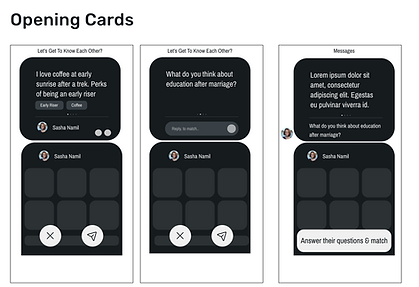
In case 1 the profile (except the opening cards) can be dragged above however this has some problems- 1. It hides the important section- answer to match and this might create confusion as this is a new feature in the market, 2. This does not improve the experience and unnecessarily complicates the experience.
So it avoid these problems we designed the next case.


Case 1 had few problems like- 1. it did not have "lifestyle" and "goals" which are important factors to decide too, 2. Audio section took unnecessary space showing the playing animation which won't improve the user experience but would increase the lenghth of the page making users get tired of scrolling which might in turn make them skip important information bellow and 3. It did not have opinion based question's answers which is also very important to know and decide.
So to remove these problems we designed the case 2.


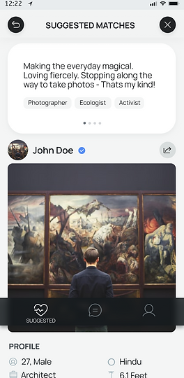
In case 1 and 2 the cancel and undo buttons are at the bottom where it will be easily accessible on mobile device (easy thumb movement) however this has few disadvantages- 1. It blocks the view and interrupts the information which is important, 2. Since it is information heavy, a button on that can increase accidental clicks, 3. making cancel so easy will increase unthoughtful decisions based on only looks.
We got few suggestions during our A/B test to keep it below but translucent, that has problems too that is- 1. It won't look like a clickable button anymore which would create confusion and 2. It won't be noticeable on a part of information
In case 3 (our current UI) although it is a little less convenient in comparison to the case 1 and 2 but it solves the above problems


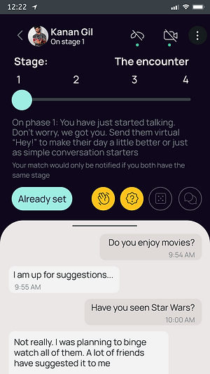
Case 1 looks good however users need to swipe through the numbers to see how many stages are in total and explore. Case 2 is better in that sense. Also In case 1 and 2, users need to go back to see the chat page, in case 3 it is easier as user just needs to swipe the chat section upward.


In case 1 we just have the "i" button for users to understand what is this feature and in case 2 we just have a "+" button for users to choose next question/activity (of the similar kind from the same stage) to send next. However both the above buttons arevery important and so we designed case 3.
A

B


6/10 choose B and from our research and discussions we found B to be better in our case as although A is clean, easy to scroll and see the answers and does not bombard the screen yet gives all the information,
B is better in this case because scrolling through the answers increases action users has to do to read and might decrease thoughtful decisions and would increase negligence.
A
7/10 choose B as no accidental clicks would occur.
After the A/B Test on discussing a little with them 8/10, they agreed that B allows a more thoughtful decision.

B


Design decisions and Feature Decisions a little.
Researched and created our own set of compatibility questions
(Blurred due to NDA)
Types of questions we will have in our app-
(A) Basic informative questions for match suggestions-
- Self information question
- Preference based question
(B) Compatibility calculating questions-
- Opinion based
- Yes or No type
- This or That type
- Rate from 1 to 5 type
(C) Detailed profile informative questions-
- Audio notes
- Opening cards
(D) Activity questions (Stages- in chat section)
- Truth/confession, situation, would you rather questions
- Couple quiz questions
Created our app's own guidelines
(To create a safer environment)
.png)
UI SCREENS OF QUESTIONS WE MADE!
(Already shown in the wireframes earlier- clearly if this is not that visible)
HOW LONG DID IT TAKE?
This took like 19 days!!!
WHAT'S NEXT?
Next will be pitching ppt and video presentation.
J
PITCHING PPT AND VIDEO
& ADDING VALUE PROPOSITION CANVAS to the Story!
It's story time!
Let's work on exciting people and investors out there!
Pitching, Value Proposition Canvas
WHY THIS STEP & OBJECTIVE?
WHAT DID WE DO?
We thought we can prepare and keep a pitch ppt and video ready to share our ideas with people (hopefully our future users) and investors to excite and make them understand our app. Also we would want resources later, for which it is important to attract investors with true information. We also would want to see if we can excite people to turn into our users, is our idea worth it?! (future scope)
We researched on pitch videos, noted important points and created our script. We then created presentations and later discussed both- the script as well as the presentation. After finalizing both, we then recorded our presentation.
HOW LONG DID IT TAKE?
This was a totally new thing for new and I highly enjoyed it! This took us 6 days.
FAULTS IT HAD? (SIR'S FEEDBACK)
Sir's feedback on pitch ppt which we noted and worked on
(blurred due to NDA)
%20(1).png)
.png)
Sir's feedback on video above which we noted and worked on
(blurred due to NDA)
WHAT DID WE DO NEXT?
We thought to make it stronger, we can show how we are creating value for our customers, to imagine, design and test the same. We thus thought of attaching Value Proposition Canvas too. During our ideation phase we had brainstormed and discussed on pains and pain relievers, gains and gain creators, job and product and services and so we decided to create our value proposition canvas to display it too.
Value Proposition Canvas:-
We learnt, discussed and design our value proposition canvas.
.png)
1st VPC
(Different type of user cases individually)
The different user cases are-
- Users who found "the one"
- Users who don’t really like someone user is chatting with & someone you don’t like from the start but after matching
- Users who are lonely (deperately finding someone)
- User who USER- Their known ones are on the same dating app
We were new to design Value Proposition Canvas so on my teammate's insisting we created one value proposition canvas model having all scenarios together.
As she said, in this we have only one model to look at, so have all gains, pains, and everything to look at togther and we can also display this easily.

2st VPC
(For all user cases together)
DID IT HELP?
Value proposition canvas helped us put the ideas we had, discussions we did and decisions we took regarding the pains and pain relievers, gains and gain creators, job and product and services into a model. It helped us recollected and refresh our purpose, aim and recheck how we are creating value for our customers, give it a second thought and this will be used later to attract and educated people (future users hopefully) and investors!
HOW LONG DID IT TAKE?
Value proposition canvas took us 3 days!
WHAT'S NEXT?
Next is creating a short exciting introductory video!
J
SHORT INTRODUCTORY VIDEO!
Where's the popcorn? It's show time!
Creating a short exciting introductory video!
Making Short Video
WHY THIS STEP?
With the feedback we got and the discussion we did in the last step, we thought it would be better to create a short introductory video first, make that exciting and informative. That could be used to excite and educate people about our app, used in ads during inviting user testing participants, user testing (seeing website traffic and conversion rate) or during we launch our application and website.
WHAT AND HOW DID WE DO?
So we wanted to create a very short video, say of 2 minutes maximum, that would explain features of our app, how it will help users and also attract users and excite them. So we wanted to make it fun and educational. For this we firstly started searching for inspirations. Then we jorted down the videos we liked, after which we started discussing- possible impact each type or combination of the two could have. By now we had enough inspiration and so we started ideating and brainstorming individually. After we were done, we started discussing. We thought of giving Canva and Figma's micro interaction a try. After trying both, we continued making on canva as for this kind off video, canva was better in terms of video we could make. We then started choosing music for our video and then decided on one- this music sounded to be really attention seeking and fun to hear! We then made a list of every important thing that should be added in the video. The video has to be short, informative and fun. So after we finalised on things we have to add in the video- we worked on the script, making it short, exciting and fun- so that we can connect to our users emotionally too.
We made this video and kept changing the speed of the frames, frames itself, the words, illustrations, etc. according to how we like and thought users would like. We kept in mind that new users would read the lines so it can not be too fast and the music we used was fast so accordingly we tried matching the frames motion with the beats we hear. Colors we choosed bright to grab people's attention and to make it seems fun. So things like these were kept in mind each time we edited.
Short Introductory Video.
DID IT HELP?
It was extremely fun and we actually used it in ads we gave after launching our website for people to signup with us through website while we launch the app (this will come later- I am so so sorry, spoiler alert!!!!)
HOW LONG DID IT TAKE?
This took like 5-6 days in total!
WHAT'S NEXT?
It was extremely fun and we actually used it in ads we gave after launching our website for people to signup with us through website while we launch the app (this will come later- I am so so sorry, spoiler alert!!!!)
K
NAME & TAGLINE
Let's give our baby app a name, and a tagline!
Naming and Taglne
OUR OBJECTIVE?
Our objective now was to name our app, some name users can connect to emotionally, at least a little relatable to the domain, making our users feel just like what the motive of our app is, serious companionship! We need such a name by which our app will be remembered. Also a tag that conveys our goal and goes with our app's actually feeling and the name!
WHAT DID WE DO?
Our objective now was to name our app, some name users can connect to emotionally, at least a little relatable to the domain, making our users feel just like what the motive of our app is, serious companionship! We need such a name by which our app will be remembered. Also a tag that conveys our goal and goes with our app's actually feeling and the name!
So we started brainstorming on names that comes from words related to our project and then discussed on them with my teammate and in between with our sir. We had several sessions of ideation and discussions. When we had a lot of names we like or think might work, both of us gave points based on 5 categories to the list of names and then shortlisted top names and so on. We conducted these sessions several times in between other steps of the project as it was a little difficult to conclude to one final name, as-
HOW DID WE REACH TO "LOVENOTE"?-
NAMES & TAGLINE (IDEATION), POINTING SYSTEM.
STORY BEHIND DIFFERENT NAMES SELECTED, WHY DID WE LIKE IT AND WHY DID WE NOT TAKE IT

DIFFERENT TAGLINES WE SELECTED FROM THE MANY- STORY BEHIND IT, WHY DID WE LIKE IT AND WHY OR WHY NOT DID WE CHOOSE IT
FAULTS:
I feel that users might not be able to connect that well with "love note" name as this word gives a (WRITE THE FEELINGS IT GIVES I FEEL) Name is the main thing of brand identity, so it should convey how we feel plus there are so many dating apps so why this one as it gives same feeling, a little scared we are {I just hope that does not impact a lot} but we now had no option, so we decided to keep searching for domains with better names we decided as and when we can.........[(frame this part properly)]
HOW LONG DID IT TAKE?
This took us 6-7 days total.
WHAT'S NEXT?
We need to test our hypothesis about our app!
L
DECIDING COLOR PALETTE & TYPOGRAPHY
Let's fill in some colors,
Let's make it- colorful!
Color Palette and Typography
Our objective now was to decide such a color palette for the high fedelity of our app and the logo and then to design such a logo for our app that users can connect to emotionally, at least a little relatable to the domain, making our users feel just like what the motive of our app is, serious companionship! and looking good visually. Color of the app and the logo, just like any other part of the app affects users a lot. It can make or break your product affecting their mood, thoughts and behavior and the logo would be the brand identity.
WHAT DID WE DO?
We first started researching and discussing on the colors that would be a right fit for our app and then for the logo from all aspects like-
.png)
After taking some inspirations and discussing on it we decided to not go ahead with-
Blue and pink because,
Pink gave the default dating and love feeling and dating nowadays is often taken as that so called immature and childish dating which are often not so thoughtful. Also since we aim for serious companionship, finding user's "the one" and we have unique features for the same, we did not wanted to give our app the default "nowadays kind of dating" feel.
Blue gave a corporate kind of feeling which is why we decided to not go for it.
Version 2- We were left with 2 colors- yellow and purple.
We did not want to take-
Only Yellow because- it would look like Bumble copy at first
Only Purple because- it might look like coffee meets bagle, Hily, Frnd app a little at first
Since nowadays these apps have become so much famous that seeing similar color and knowing its of the same domain might give our users first impressions as some copied app and would make them remember those apps -> this might work for us negatively as both our aim and features are too different. If first impression is the last impression in some cases, we need to be careful about it.
So we thought of using both yellow and purple in combination, although we were not very sure how it would look like as both colors are too dark and bright, it wont work but we still gave it a small try.
And this is how it looked- :(
How good it would look along and in combinations with other colors- aesthetically
Color psychology and does that match with our aim and goal for our app. We wanted something that feels fresh, warm, let's users take thoughtful decisions being serious yet calm and free.
How much users would relate to the colors used with a serious companionship app.
For the app first and then the logo we had multiple rounds of ideations, discussions and decisions.
Version 1- Firstly we were thinking something around- blue, yellow, purple and pinks-

So now we decided to change purple to cyan (a relaxing, calming color very similar to blue and a little like purple) and use both yellow and cyan.
We were still not sure about the decision of using both the colors together as both would be eye catchy at one time if used in a single screen together causing users eye on both the color spots at once decreasing the focus from the main area and decreasing the experience making everything eye catchy at once
One trying it a little, It looked like this- :(

OUR OBJECTIVE?
.png)


OR
Version 4-
We then finally kept our Primary color as Yellow however we now decided to not keep 1 single color, rather we decided on bringing a little orange and light pink into picture. Also for Secondary color keeping not exactly black but a little closer and for Tertiary keeping dark and light cream color
Orange because yellow was kind off being too bight for this and also reminded us of Bumble (one of our competitor apps)
Pink because users could relate pink to something related to dating (however we need to be careful as to what pink we choose- light pink can be like baby pink and drak pink can become too passionate not matching with our theme and aim) and also because Pink with Yellow (or say a little orange) but the secondary and tertiary color choosen looks good in our opinion.
Also we kept the color options side by side and used the black and white filter on them to check the contrast, more the contrast the better here like-
.png)
Version 3-
We now learnt that we can not use 2 bright and dark colors together in one screen and even if we decide to use, we have to do something with their visibility, contrasts, brightness, etc.
We then decided to choose either cyan or yellow and keep it as our primary color.
We also reduced the brightness a little, changed the hex code from the previous versions and decided to go with yellow as the primary color as it gives warmth, friendly, happy environment for users to feel safe, happy and decide better not making the environment too serious but fresh and warm. So we decided Yellow as our Primary color and decided the following color palette and typography as it looked good on the wireframe and was simple-
So this is what we decided- :)

.png)
.png)
HOW LONG DID IT TAKE?
This took roughly like 1.5 weeks.
WHAT'S NEXT?
Let's now test our hypothesis and validate our solution ideas!
WHAT DID I LEARN?
I learnt further about the color psychology and deciding proper color based on the product
I learnt how applying black and white filter on colors help decide better
Version 5-
Version 5 is same as Version 4
except the typography which changed from Manrope to Montserrat (after our user testing for the website and the A/B Tests for the logos)
M
TESTING OUR HYPOTHESIS TO VALIDATE OUR IDEA
Before actually launching our new product, let's test our hypothesis and validate our ideas.
TestingHypothess to Validate Idea

OUR OBJECTIVE & WHAT DID I DO?
So now at this stage when our app is ready to get launched, we need to test our idea and the product, if it actually suits the market. We believe that this step is very crucial as any small part of the project going wrong can also break the entire product and also our must understand the users in the market we are in actually like and support our idea and our product because ultimately its for them, for their benefit and they are going to use it. We also believe that it is always cost effective and healthy for the product to be tested before actually launching it in the market to realize issues in a part or the whole idea and make necessary changes before it's too late.
WHY THIS STEP?
We want to efficiently and successfully test our product idea, product's user experience and the product as whole, make any changes needed if necessary, involve the user community as they feel they are a part and this product is for their good after all and then launch our application hoping for our app's successful existence and performance in the market, something our users fall in love with, something once they use they will never need any other dating application (not even ours) and they would have already found their perfect "the one"
So we were planning for the most effective way to test our product. We had researched, thought of and worked for preparing for 3 types of testing (for before launching), however we went forward........theres a twist, keep reading 😁
TEST IDEA 1- THE TEST CARDS!
WHY & WHAT DID WE DO FOR IT?
We thought, discussed and noted our hypothesis and *thought of creating* test card for the test to validate our ideas (solution-the product!). We used test cards to properly plan the hypothesis and how are we going to properly test the hypothesis. Then we planned how to conduct the test, where to conduct and so on.
We were also thinking and researching about platform to store user participant’s data to store it for future tests, interviews and surveys too. We researched and noted few platforms, tested those platforms ourselves. Also researched for platform to get participants only from our user group we are working for, so we researched on platforms like usertesting.com, mechanical turk, etc.- however we did not go further with these platforms as we got feedback from our users that for our purpose and users we won't get participants there, so we stuck to the way we get participants normally- by sharing on social medias and contacts and their contacts!
Then for the test, we created hypothesis, how would we analyze those hypothesis- what things would mean our hypothesis is successful or not, and created the test cards for our participants.
So this is what we thought here-

Our Plan for this step!
WHY THOUGHT OF THIS STEP BUT WHY IS IT NOT FOR US?
We used test cards to properly plan the hypothesis and how are we going to properly test the hypothesis however,
at this time we knew what we wanted from the test but not properly, we were not clear with how to properly evaluate our hypothesis and also we were not not clear if test cards would work for us in this scenario. So rather we thought of first clarifying, understanding our hypothesis and how to evaluate it properly and then properly plan about how to take the user test.
TEST IDEA 2- BEFORE & AFTER PROTOTYPE TESTING
WHY & WHAT DID WE DO FOR IT?
So here our test plan was to call users for user testing and first ask question before showing them our prototype and then show them our prototype or say make them explore our prototype and then ask them questions.
We rechecked our prototype for proper linking and working, then created 2 main set of questions- one for before user seeing and using prototype and one after that. These 2 set of questions consisted of questions from all sections of our app. Reponses from these 2 set of questions would help us analyze what people think of this before and then after showing and using prototype- how much they could connect with it and how easy and problem solving it is for them.
WHY THOUGHT OF THIS STEP BUT WHY IS IT NOT FOR US?
We thought of this step to understand effectively if users are able to connect and are we able to reduce and remove their pain points, realizing the problem do they see the solution in our app. We think it was a great testing idea and could work however there are certain things-
Firstly the questions we had created now in total are huge and would result in huge discussion, so asking users questions, then showing them the prototype and then again bombarding them with questions again would exhaust them after their answers as well. This might work to some extend if we effectively reduce the number of questions by merging the similar type of questions in such a way that we still get the valuable answer we need or prioritizing the questions, we planned to do that next, however we have another point to consider, i.e.-
Since we just have design prototype, it is not dynamic. Users won't able able to explore, use and test the main features that needs to the tested like matching, chatting, etc. This is unavoidable- so we changed our testing plan!
To analyze at this stage, verbally like this was not a good option. We need some way to understand in real life that users are interested in our idea, in our product, they are able to relate to this and their opinions on it, we need to check the conversion properly and thus we could test our idea properly in real life


These questions to test into some cards like this
TEST IDEA 3- CONVERSION FROM ADS, SIGNING UP!
WHY & WHAT DID WE DO FOR IT?
We wanted to see if our product excites people and how much! Are they willing to signup to our product seeing our ads (showing them our solution in an exciting way). This way we can test if our solution has that power to help people and stand successfully in the market, do users believe our solution might have the power to remove the pain points the exists and that we tried to solve. We would start with ads and let people signup through a form and side by side we would develop our app.
We did the following-
- We researched on the platform we should create the signup form on ->
We were in search of such a platform where forms don't look like default google forms as it is already overused and users would get bored of it, since they are signing up for our app and to avoid users loosing interest we wanted a platform where forms can be modified and aesthetically be changed.
Also since our signup form would have a lot of jump functions, we needed some platform which would have this.
We found platforms like-
Survey Monkey- which also had very simple look and overused look and we did not have the freedom to change the look and feel of the form there
Typeform- it gave us the freedom to change the look and feel of the form and had jump functions
Jotform- this also gave us the freedom to change the look and feel of the form (more than Typeform) and had jump functions
So based on the functions, features, our requirements, cost and other comparisons we had decided to go with Jotform,
However we started using both and found that Jotform had a lot of technical problems. At last we did not go with either of them as we changed our plan. Keep reading :)
WHY IS IT NOT FOR US?
But then to make the "exploring and using" our product for our participants more realistic to get real world feedbacks and giving them a better understanding of our app which would help them decide better to signup or not and make our testing more accurate, we thought of creating our app's website (we do not have our app developed yet- in case you are wondering why not app😅) and then create and give ads.
TEST IDEA 4- CONVERSION FROM ADS TO WEBSITE TO ACTUALLY SIGNING UP!
WHY & WHAT DID WE DO FOR IT?
We thought of ways to make the "exploring, using and testing" our product for our participants more realistic to get real world feedbacks and giving them a better understanding of our app which would help them decide better to signup or not and make our testing more accurate, we thought of creating our app's website.
So we thought of creating our app's website (landing page), create and give ads, create signup form. We wanted website for - 1. Users to understand better about our product hence allowing them to take thoughtful decision for signing up, 2. Since our product is new having our own website looks authentic to users helping us win their trust to some extend and 3. If the website's content connect well with users it contributes a lot to the conversion rate.
We wanted to see if our product excites people and how much! Are they willing to signup to our product seeing our ads (showing them our solution in an exciting way). This way we can test if our solution has that power to help people and stand successfully in the market. We would start with ads and let people signup through a form and side by side we would develop our app.
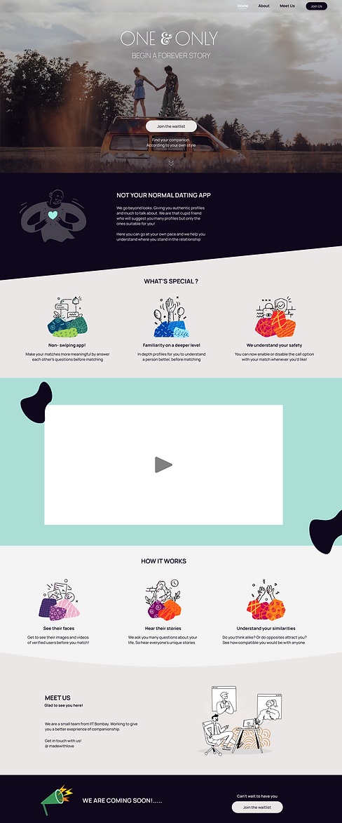
Our website (landing page)
We thought of going with the external signup form idea but thought of dividing different signup sections into different forms as everything in one single form was becoming large and this would cause- 1. users to get tired and frustrated affecting their answers, 2. increase in the dropout rate as users would become tired, bored and discouraged.
Since this project is for user afterall, we wanted to build a community, an online presence where users are free to share their opinions and feedback and the app and their companionship together improves! we so added feedback and improvement focused questions too here.
So this is how the form looked-
The 3 sections were - 1. self info (basics and about the nature and characteristics)
2. match preference (to know what is user's kind from user's perspective)
3. compatibility questions (situation and choosing type questions to understand the user's nature, characteristics and traits
However since this was the testing phase and keeping such a long form (even if we divided them) might result in dropout rates to increase and users getting discouraged and bored, which is both harmful for our product and testing.
So next we thought of focusing on (important and only those questions which are very important for our testing) ->
1. self info, some questions to understand their nature and what type of person they are, a little preference (to see if they are willing to share these kind of details),
2. user feedback (to know what they think of our idea and to get their opinions),
3. bio and opening cards questions (this feature we already have on our app and to check if users are free to fill this and what is their experience like)
This is how the form looked like-
However then we thought of not keeping external forms and develop form within our website as it looks more authentic, we can customize it from scratch according to the look and feel suitable for our product and users
So this is how it looks now-
Form here became shorter, very basic and important things asked that is important for not only basic profile but also for the initial testing
Designing and developing this entire website and the signup form in itself has a lot of versions (Do check this out in the "Hi-Fi" Sec
WHAT DID WE DO ABOUT IT
Soon to launch!!!!!
WHY THIS WORKED AND HOW DID IT HELP?
We hope to get an awesome and positive response!!!
HOW LONG DID IT TAKE?
This entire section took like 1 month
WHAT'S NEXT?
After we launch we have to track and analyze the response, the conversions and so on.
For this we decided to-
- Use eye tracking and analyzing tools for user behavior, conversion from ads to website to signup and so on.
- Analyze the feedback received on the signup form
- Get feedback from social media community (on our handles)
- Get feedback from quick surveys on our application, and website (if needed)
We thus planed how to analyze the response
We also planned how to go ahead with the development, launch and social media presence- we started of by discussing and planning our budget and thus went forward in the process!
%20(1).png)
Budget Proposal
(Parts of the image are blurred due to NDA)
We created budget proposal after discussing, understanding the needs, researching on them.
Now next comes the Hi-Fi
N
HI-FI
Let's fill colors to the zebra looking world!
○Logo ○Application ○Website (Landing Page) ○Signup form (on website)
high fidelity- Logo, App, Website, SignUp Process Form
N(1)
The Journey of "Logo" Creation
We need a logo that is unique, conveys our product's aim, users can connect with it and they feel positive, good about it- just like we want.
WHAT DID WE DO ?
We first started brainstorming, ideating, looking for inspirations, sketching (with pen and paper and on Figma) and discussing
We had different names selected from time to time and for all the logo ideation phase are below-
Version 1- Process
Problem with version 1 logo-

Problem here was-
- Although the story behind the idea is to the point and gives a warm forever feeling, to some of us it was not that connecting
- The name of the app changed from "made with love" to "one and only" to "love note" and although a "O" is also a shape, it reminds of the letter "O" which is no more our initials
Soo taking inspirations and notes from this, lets move forward....
Version 2- Process

Version 2- Top 2 logos
We conducted an A/B Test to understand if users connect with the logo emotionally, do they relate the logo to our domain, how they feel about it and do they find the logo pleasing, also which one would they choose and why.
So we showed them both the above logos, heard them opinions on each and their choice, and asked them questions on the following-


Responses
We noted, analyzed, discussed and started working on the same!
Ver. 3-Process
.png)
Ver. 3- Top 2 logos (and 2 types of each)
P.S. We also changed the typography here
We again conducted A/B Test, in the same way and noted their responses similarly for the above logos.

Responses
We noted, analyzed, discussed and started working on the same!
Although the color yellow is a warm, friendly, optimistic and cheerful color making our users feel warm and fresh, impacting their trust on our platform's environment (warm, happy and good people on the platform) and their decisions ultimately,
and orange (since yellow reminded our participants of bumble, and they could relate pink or red with dating apps- but red looked to passionate and pink the default immature love- which we did not want so we went with orange as-
- it is in between yellow and pink
- it is similar to yellow in psychology a little like a little warm and optimistic, yet close to passion red or say love pink
- makes us unique and different from our competitors as we are)
we thus wanted to use these colors- yellow with orange
However even now, after choosing the shade of orange and yellow as we could , users to some extend still expected something in pink so we continued our exploration, discussion and creation.
Ver. 4-Process
We decided to keep this logo as-
-During later user testing (of website) we checked if users could connect to version 4 logo and the results were better than before. We can come back to this in future too but this is good to go for now
- We converted the logos into the black and white filter to understand their contrast because
1. Since there are 2 colors larger contrast looks better here
2. It would be recognizable when the logo is converted to black or white depending on the background and the usage.
Applying the black and white filter to understand the contrast
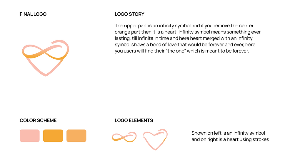
Our final logo!!!🤩
WHAT DID I LEARN?
- User testing and A/B Test always give wonderful new insights
- To use black and white filter to understand the color contrast and that it is so important, before this project I honestly did not know this
- more about color psychology and where to use what kind of colors
HOW LONG DID IT TAKE?
This entire step took like 3-4 weeks


N(2)
Filling colors to our app wireframe
Have color palette check, have creativity check, teammate is ready too check, lets start!!!
HOW DID WE DO THIS STEP?
Me and my teammate, we both started filling in the colors from our color palette as decided in the wireframes we both had designed similarly. At points where either of us did not agree with the decision of another, we had discussions, thought on the same, decided on one thing and moved forward with it. (Similar to almost all other steps)
Hi-Fi Screens

It's Show Time- Hi-Fi version of the app LoveNote
HOW LONG DID IT TAKE?
This took like 2- 3 days.

Hi-Fi Screen-Prototyping
N(3)
Let's create our website! (Landing Page)
A place where users can understand us, our aim and our product more, get the feel of it, emotionally feel the depth of the problem and the importance of our solution, give our solution a thought- if they like, be with us if don't- give us their opinions and be with us, website would be one of an online platform to stay connected, believe we are authentic and believe in us, have an option to signup from website too.
Initially this website's purpose of to test our product idea, how well can the idea excite our users and do our product idea have the power and potential to stand straight in this market- however while the website was getting developed, app also got developed and so we changed our testing plan to something more realistic, it was a good chance now to get real response in real life from real product- with version 1 of our app! (what is version 1? find out in the "development" section)
WHAT DID WE DO?
We had to create a website that not only gives knowledge our us, our aim and our product to the users but also emotionally be able to connect with the users positively. One thing I learnt from my Sir here is that, the words we use, the sentences we frame should not only be short and to the point but should have emotional attachments, reading which would create a positive impact on users- this can be a game changer!
Different versions of the website (desktop)-

.png)
Ver. 1.0

Ver. 3.0

Ver. 5.0 - latest final version!

Ver. 2.0

Ver. 4.0

WHY & WHAT DID WE DO?
"BANNER" & "FREEZED NAVIGATION BAR" Section-

We had to keep the banner such that users can relate to the product, feel fresh and get the positive vibes we want to share, that would match our aim and ideology.
We did a user testing on the website and from that we kept changing the typography.

We did a user testing on the website and from that we kept changing the typography and the feel.
Depending on the banner image, the position of the text changed due to visibility and better user experience


We changed the CTA button on the navigation bar to yellow to match our color palette and also since it goes better with the banner image
Some explorations and ideations for the banner image to match our ideology and theme, for users to relate better

"WHO WE ARE" Section-

⬅️ This section in version 1 and 2 of the website is not needed since this "who we are" is in a more impactful and proper way in other sections of our website.
This section looks too dull and text heavy, also conveying basic details in a basic way- this might impact users not positively and they might not read this.
So it is removed.
"WHAT'S SPECIAL" Section-
Just after the banner comes this section, this tells what special features we have that makes us different from the rest, our solutions to some problems.
This section not only must be very short, to the point yet conveying the message well but also emotionally connecting.
We thus discussed, framed, took opinions, re-discussed and reframed till we reached to the version that could be used.


.png)


We had 2 major problems-
1. It was difficult to convey everything yet keep it short
2. It was difficult making it to the point yet sound soft and smooth, emotionally connecting
However, over time we tried improving it with-
1. Multiple discussions, analyzing opinions from our Sir and from the user test we conducted and reading more about the same, understanding why the previous version was problematic and implementing new versions.
"HOW DOES IT WORK" Section-
This section talks about all features we have, how do we help users and so on.
We thought of not keeping wireframes and explanatory text or audio beside it as it is highly over used, gets boring after a time and users might skip that part.
Our aim was to explain everything yet in a fun and exciting way which would help users avoid skipping the section and enjoy the part as well getting all information they need on how do we work.
Here are the different versions-
This looked not very attractive and interesting, also users often understand and tend to read more when a little relevant animations/images are added.
Also there is a lot more in what's special to be added for users to know and understand our unique features, so the format of the images and text and the way it is presented must be changed

"How does it work" section- Ver. 1.0
"How does it work" section- Ver. 2.0
"How does it work" section- Ver. 3.0
"How does it work" section- Ver. 4.0
We changed some images used, animations, idea, text , visibility and typography in this section from time to time as we got feedback from our Sir and from the User testing we did and as we believe the designs would impact users psychologically- after analyzing, discussing, ideating on the same.
.png)
Some explanations for changing from version 1 to version 2
ABOUT US kind off Section-


Aim, vision, mission, etc. are important part we should not avoid. Also keeping our product in mind we can keep some image that is more connecting.
Footer Section-


Yellow is our primary color however pink also being in our color palette, we gave pink a try and pink in majority opinion looks good overall in the website.
Different versions of the website (mobile)-


Final Version
Try 1

Why did I make the design changes
N(4)
Let's create our Signup form! (Signup Process)
We have to create such a signup form where-
- Users should not find the process too long and thus leave in between or get bored impacting their answers
- Form should not look like default forms, but something that keeps them interested
- The Signup form's user experience should be smooth and painless
WHAT & WHY DID WE DO?
Different versions of the form-
Here we conducted user testing on our website and the form. Since our form design was not yet developed and so it was not dynamic- we created similar form (with posiible questions) on Jotform.
Jotform as jotform made creating very similar form possible giving the same look and feel to get better test results on actual product.
Form for user testing

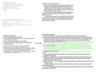.png)
Hypothesis, Question to ask, Responses and Discussion
Not Readable (Due to NDA)
Version 3- Final version of our Signup process (form)
Here we changed the way question are arranged i.e. instead of one beside the other we kept it one below the other after analyzing the responses we got from the user testing we did.
Also, we changed the look and feel of the form as the previous one looked dull, so version 3 is better to keep users interested both in terms of the ease of filling the form, length of the form and aesthetics.
Mobile version-
Ver. 1.0
Having entire onboarding process in the signup form and survey type question on the landing page

Ver. 2.0
We can just ask the important and mandatory questions required during onboarding and rest can be asked on app, since this was initially just for testing, we can keep it to the point and even if app gets developed, users can be redirected to the app for more.
Also we should ask the survey question here itself as making users fill form from different places would reduce the chances of users actually filling the forms, also negatively impacting their experience
Final version of the signup process (mobile version)
Some Design Decisions-


O
DEVELOPMENT
Let's get launched!!
Develpment

STAGE 1-
Let's give design to code converting plugins a try
Since we are UI/UX Designers and had to spend majority of our times on this aspect, we thought of rather giving design to code converting plugins a try.
We tried few such plugins a try like- Supernova, Fronty, Figma to HTML, Anima and Quest. There were some or the other problems with each one of them (however initially we had considered Quest) and we concluded that developing the website from scratch would be a better option.
We anyways have to hire developers for the app as it is not as simple as website in comparison.
I and my teammate helped sir to create the problem statement for the selection assignment and prototyped the wireframe for them
STAGE 2-
Let's get web and app developers on board!

Problem Statements for app and web developers
(Blurred due to NDA)
App Wireframe Prototyping
(Sent to the candidates- had to do as per the problem statement mentioned))

Website Prototyping
(Sent to the Candidates- had to do as per the problem statement mentioned)
STAGE 3-
Explaining and Providing with the necessary requirements to the developers-
Me and my teammate had regular meets with the developers to explain them our product, our target, our deadlines, etc. and provided them with necessary things they need like illustrations to be used, logo, style guide, fonts, images and videos used.
We provided and explained them the feature prioritization and information architecture for their ease and better understanding and working.
We provided them with Sitemap and Created a document containing things to remembers to help them develop the product like we want.
We also are always available for their doubts and queries regarding the app features and flow.
App SiteMap
App SiteMap Video
(In case the above picture is not that clear)
.png)
Style Guide
(for website)
Rest everything (as mentioned) was already shared and explained on regular and impromptu meets and calls
STAGE 4-
Regular App Testing (App and Website), Raising Issues
& Solving their Doubts
As the app and the website was being developed, we regularly kept testing both the website and the app. We kept informing them about the technical and the UX problems they had, raised issues on Github and managed them. Kept regular and impromptu meets and calls for the same!
We also had meets with the developers and Sir separately to discuss about the different versions we should launch dividing the features due to the time constraints (as rightly said by our Sir that we are working on it since 7 months now and this is the right time to get it launch, even if that means to launch it in parts as then we will get the real life responses and after which we can thus work on the problems our product faces in real life), the time our developers would take to develop a particular thing and what exactly they can develop and for what we would require more help from some other interns. Later accordingly I and my Teammate Designers re discussed of the feature prioritization and changed it according to the current scenario and current needs.
Along with managing the developers and testing the product, we always provide them with small UX Designs and discuss on the same as needed.
Some issues (out of many)
P
SOCIAL MEDIA PRESENCE
Let's show the world who we are!
STAGE 5-
After Launch Testing Plans-
We are eagerly waiting for the launch to observe user behavior and analyse how our product performs. We also planned after launch testing methods-
- We will use Eye tracking tools to observe and analyze user behavior on a certain part
- We will use Analytics tool to understand the analytics
- We will conduct short surveys on the app
- We we analyze the response we will get from website signup form
- We will analyze the performance of social media handles and ads
After analyzing from all the above methods we will discuss and plan for further changes or improvements or steps in general we required
Social Media Presence
WHY AND WHAT IN THIS STEP?
We now require to create a social presence, let people know we exists, and spread awareness about our features, aim, the problem that exists and how we can help them get a better experience and a partner for life for them to have a happy life ahead.
Our main aim here is to connect with our future users, the community.
We also are a team who aims to improve and remove user problems both in their experience and ultimately in their real life, thus we need constant feedback from them and we will be happy to improve. However for this we need them to feel free and connect to us, keep sharing their opinions, expectations and pain points and so creating such a community is also a target!
IDEATION AND EXPERIMENTATION PHASE
We want to create engaging post, not too informative and text heavy as it gets boring on social media but informative and fun. Something users find relatable, informative and fun, something that makes them see the ray of hope for the problems getting solved.
We decided to work on Instagram, Facebook (from the start) and then maybe other platforms like Medium or other blogs platform, Twitter, etc. We researched on where we should give our ads, what formats should the ads be of (like posters, videos, gif, etc.) and what kind of posts suits each of the above platforms and what will thus help us!
We thus started Researching, Brainstorming, Ideating, Discussing and Making the contents and Creating the social media handles.
We created few videos, posts (like introductory, fun, memes, statistics, etc.) that people can connect. We also ideated, discussed and wrote 8-10 scripts for ads, series, etc. (You will see the once which we will post online, stay tuned! 😁)
BRINGING CONTENT CREATORS ON BOARD-
We also knew that we want some one with us to help us grow our social media handles and thus reach out to our users. It will not only help us connect with our users but also keep them updated on our progress thus helping our product. Also we could build trust of our community online.
We thus needed someone to- write content (maybe blogs, for requirements, for website, etc.), create and edit posts and video and won't hesitate to be our product's face when required. Someone who could help us reach out to more and more of our users and thus improve pu handles i.e. someone good with social media marketing- researching on hashtags, etc. and knowing a little SEO would help a lot.
We thus decided to hire Content Developers with all this requirements.
I, my teammate and our Sir did the Hiring where for the first time I hired 2 interns right from the starting (i.e. from selecting their applications, to preparing their assignment and selecting their assignment to conducting HR Interview with them to selecting 2 interns finally!!!)

Some posts, gifs, videos and scripts we created!
(You will see the once which we post soonnnn!)
Understanding what we exactly want and creating the application online
Also brainstorming on assignment to be given to the selected candidates.
We had introductory meet with them, to explain them our aim, goal, further plannings, our product, etc. and we regularly have meets with them sharing with them what we had thought of, our ideations, etc. and then discussing with them how to meet our targets regarding the social media handles, connecting to users, etc. and as discussed and agreed on, in the meet, we check their work, if everything is going on track, etc.
Assignment for them- as per the requirements


Few HR Interviews
Noting down the responses and Discussing on it- to select content development interns!
MANAGING CONTENT DEVELOPER INTERNS-

We had introductory meet with them, to explain them our aim, goal, further plannings, our product, etc. and we regularly have meets with them sharing with them what we had thought of, our ideations, etc. and then discussing with them how to meet our targets regarding the social media handles, connecting to users, etc. and as discussed and agreed on, in the meet, we check their work, if everything is going on track, etc.


LoveNote on ->
COMING SOON!!!!
(END OF SEPT OR BEGINNING OF OCTOBER 2021)
bottom of page